Remember when Instagram stories were just that place you posted photos and videos that weren’t pretty enough to make it onto your main grid? Oh, how times have changed!
While stories still have a more raw, unfiltered feel to them than feed posts, you may have noticed they’re becoming more polished and professional looking. From beautiful graphics to rose-tinted videos, stories have really become an extension of your overall brand aesthetic.
With more than 500 million people using this feature daily, there’s now even more competition — as well as opportunity — on Instagram stories than ever before. The good news is, you don’t have to be a professional graphic designer to create stories that stand out against the crowd!
Thanks to simple editing tools (some that are even hiding out the Instagram app!), you can quickly and easily take your stories to the next level. Read on for 7 designs hacks for creating show-shopping Instagram stories that may not be on your radar.

1. Add animated filters to photos from your camera reel
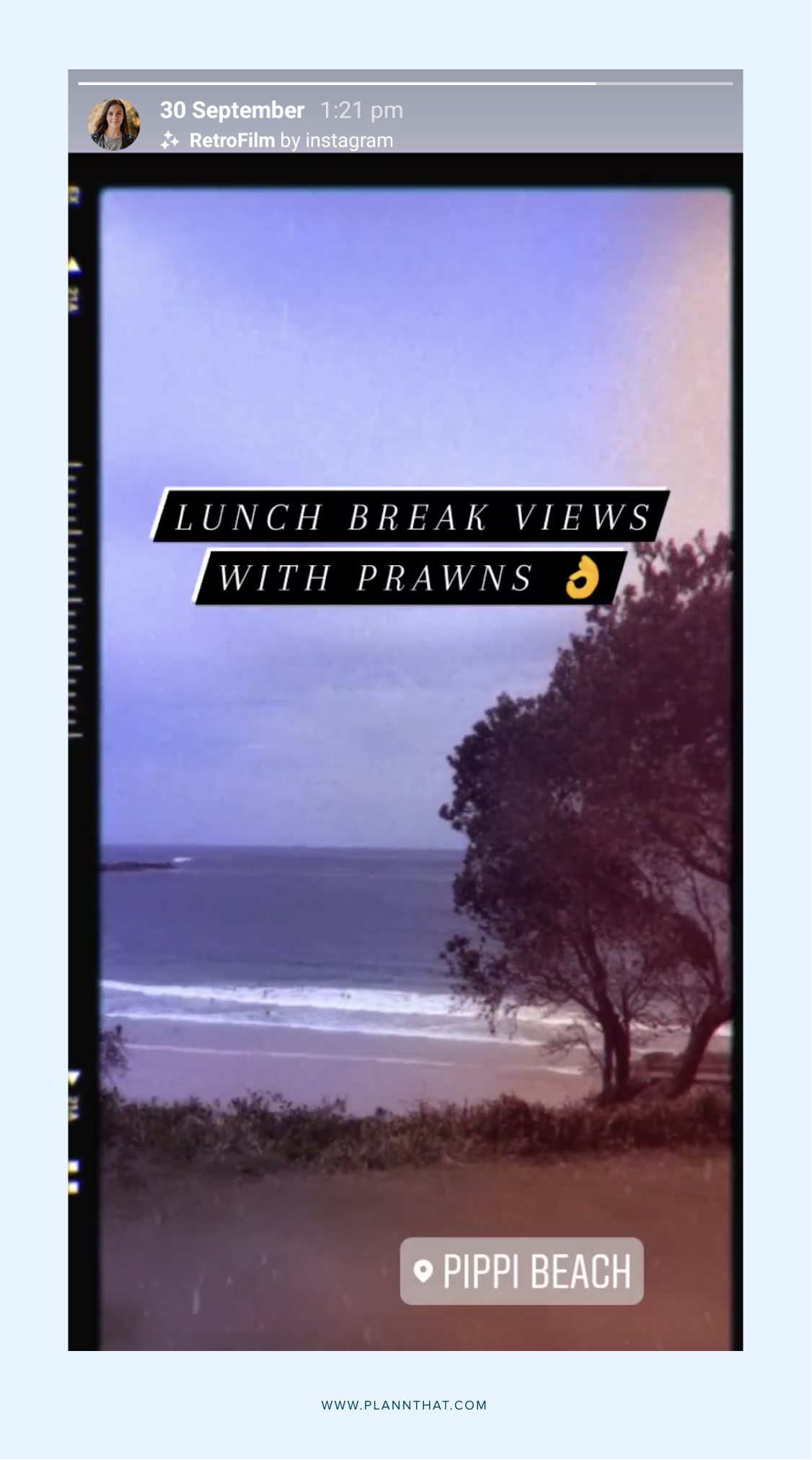
Okay, so unless you’ve been hiding under a rock, you’ve probably seen that you can add AR (augmented reality) filters to your videos on Instagram stories. Some of these add pretty effects to your stories, and some of them have fun, interactive elements like giant moustaches!
But, what you may have missed is that you now add these to photos that already exist on your camera reel. Previously, you could only use these on videos you captured using the live camera within Instagram. But now, you can use these to jazz up a boring selfie you took two weeks ago, before adding it your stories!
While unfortunately, you can’t choose from the entire library of filters from creators in this mode, there’s a handful of in-built Instagram stories filters you can choose from.
With animated effects, they’re a great way to make static photos feel more dynamic when you post them to your stories.
Our personal favorite is the ‘Retrofilm’ filter, which looks like an old-school camera!
2. Use the eraser brush tool to create patterns
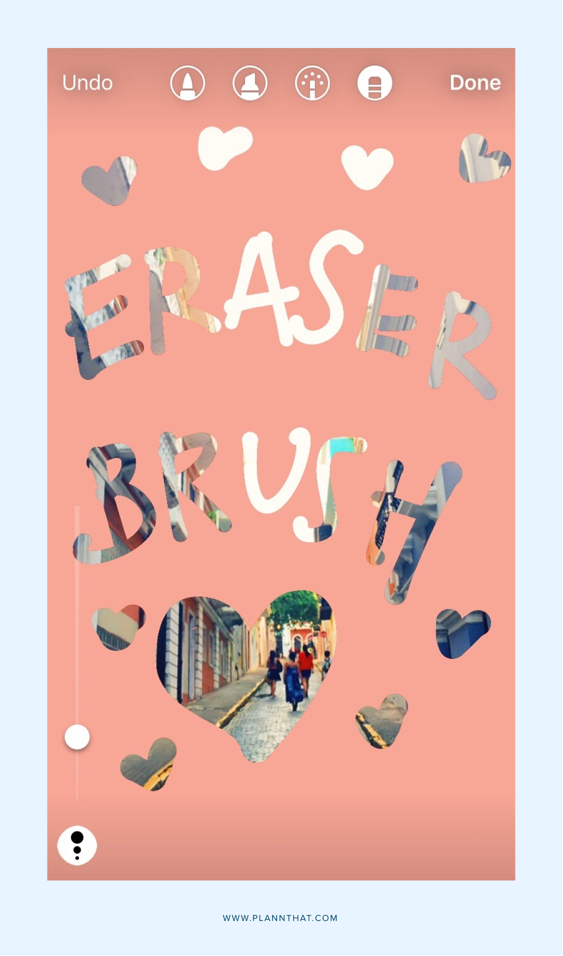
If you’re anything like us, the last time you used an eraser was probably in elementary school. But, the eraser tool in Instagram is actually a fun way to add extra visual interest and intrigue to your stories.
You can use the dropper tool to add a solid color to your story, then use the eraser tool to make ‘cut out’ pattern with negative space. You can also use this to create a shading effect on your text.
However, perhaps our favorite way to use the eraser brush tool is to tease something exciting that you’re going to be announcing soon. Whether it’s a new blog post or a product reveal, you can add an image of it to your story — then use the eraser to remove most of the image, leaving only a glimpse showing. Then, your followers can guess what you’ve got coming up! It’s a great way to build hype.
3. Experiment with layouts mode
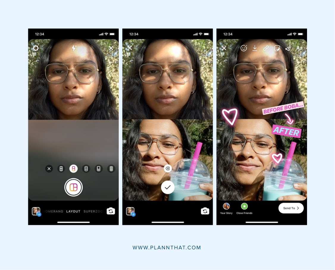
Who says you can only post one photo to each story frame? Thanks to Instagram’s layout mode you create a collage-style graphic of up to six different photos! This can be a handy feature if you’re trying to show off a few different photos from the same day or occasion.
4. Add a halo effect to your stories
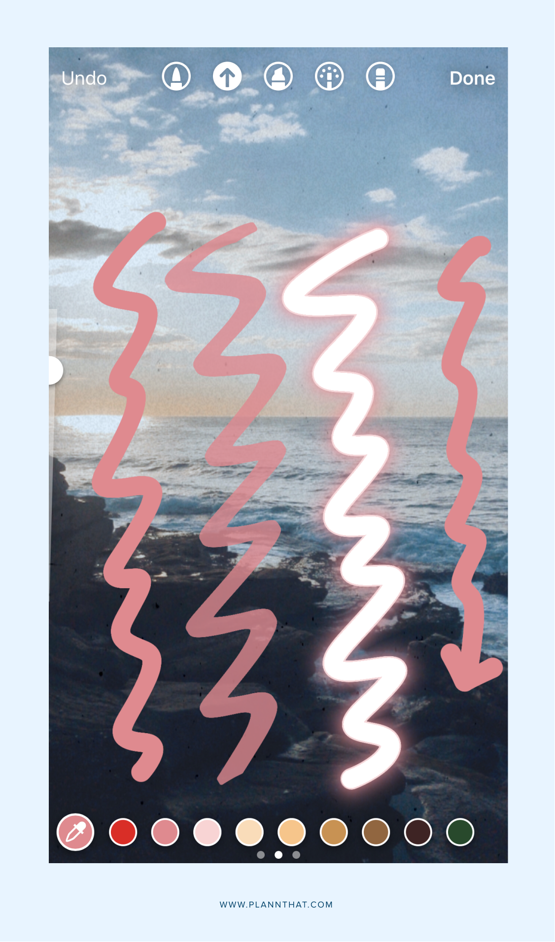
Baby we can see your halo….well, at least we will be able to, once you’ve used this feature! Here’s one that may or may not already be on your radar. If you navigate to the paintbrush menu in Instagram stories editing tools, you’ll see one that looks like it has sparkles coming out of it. You can use this to add a glowing effect to your stories. It’s perfect for adding emphasis to your text (you can also use the neon text button to do this) outlining elements in your photos or, yes, drawing on the halo that we all know you deserve!
5. Add your brand colors to your posts
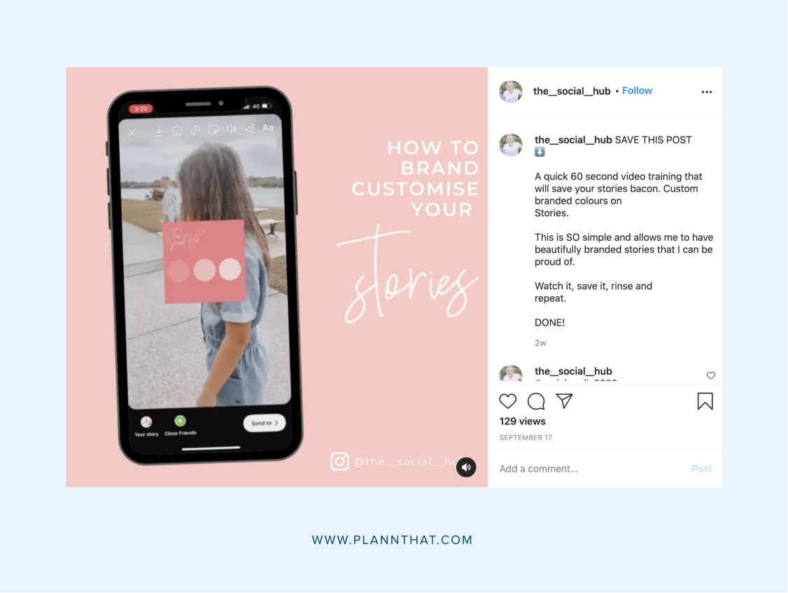
Via @the__social__hub
If you ask us, the easiest way to make sure your Instagram stories are always on-brand is to set up templates in Canva — which you can them access and schedule without even leaving the Plann app. You can also find your best-performing color palette in Plann’s analytics section, complete with the exact code.
But, if you’re looking for a different way for when you’re posting on the go, we’ve got just the thing for you. Take a screenshot of all of your brand colors in one place — perhaps from your brand kit, if you have one. Then, navigate to that image and press ‘copy image’.
When you’re creating a story, paste that image to your story. Then, use the color picker tool to take those exact hues from the photo, and switch the color of your text or text box. Delete the image from your story and voila, you’re good to go!
6. Copy your logo onto your stories
On a similar note, you can also use the same copy and paste technique to add images into your story. One time where this comes in handy is if you want to add your logo onto your stories as a watermark. As in the above step, just copy your logo form your camera reel, paste it on and position it anywhere you want it. Again, we think the easiest way to do this is to just set up a template within Canva, but this is still handy in a timecrunch.
7. Overlay beautiful text on your images

Have you experimented with Instagram’s new fonts yet? There are now nine different typefaces to choose from, ranging from pretty cursive fonts to bold and bubbly. They also have different shading and border options, so be sure to have a play until you find a look that works for you.

