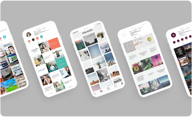
‘Structure will set you free!’ someone special (and frustratingly right, gah!) said to me as I threw a tantrum about not knowing what to post on Instagram. However, once I discovered the concept of Instagram grid layouts, I felt like a whole new person!
Having a set routine for what to post changed my relationship with Instagram. If you’re feeling this way at the moment, here are 15 interesting, creative ways to play with your own Instagram grid layouts!
Answers to Common Instagram Grid Layout Questions
Before we begin, here’s a quick FAQ.
What Is An Instagram Grid Layout?
An Instagram grid layout is the visual arrangement of your profile’s photos and videos. Think of it as your brand’s digital storefront. When someone visits your profile, the grid is the first thing they see, giving an instant snapshot of your style, personality, and overall aesthetic.
Why Is An Instagram Grid Layout Important?
A cohesive Instagram grid layout creates a strong first impression of your brand. A well-organised grid can also impact user experience, making your content “binge-worthy” and increasing engagement and followers.
How Often Should I Update My Instagram Grid Layout?
There’s no one-size-fits-all answer here. The key is flexibility. Update your grid layout to align with brand campaigns, seasonal changes, or new marketing strategies. It keeps your profile fresh, relevant, and engaging, ensuring you stay on top of trends and maintain your audience’s interest.
Read More: Best Times To Post on Instagram in 2024
15 Captivating Instagram Grid Layouts
Save your sanity and put a structure in place to ensure you can maintain consistency. Here’s a breakdown of 15 creative ways you can plan out your Instagram grid posts to keep them visually exciting, organised and authenically you.
1. Create a Checkerboard Effect
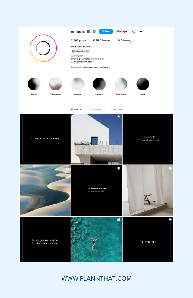
Checkerboard Instagram grid layout example
Like your home floor tiles, the checkerboard grid layout alternates posts to create a visually striking pattern. This layout often uses two solid colors to create a consistent checkerboard effect, and it’s great for adding visual diversity while keeping your feed cohesive.
Try alternating text quotes with photos like Minimalism Life or mix close-ups with landscape shots to create a unique and engaging feed.
Another way to use the checkerboard grid layout is to alternate variations of colors. For example, every second image might be white, or you can use more white space and alternate with a “busier” image.
2. Use Horizontal Lines
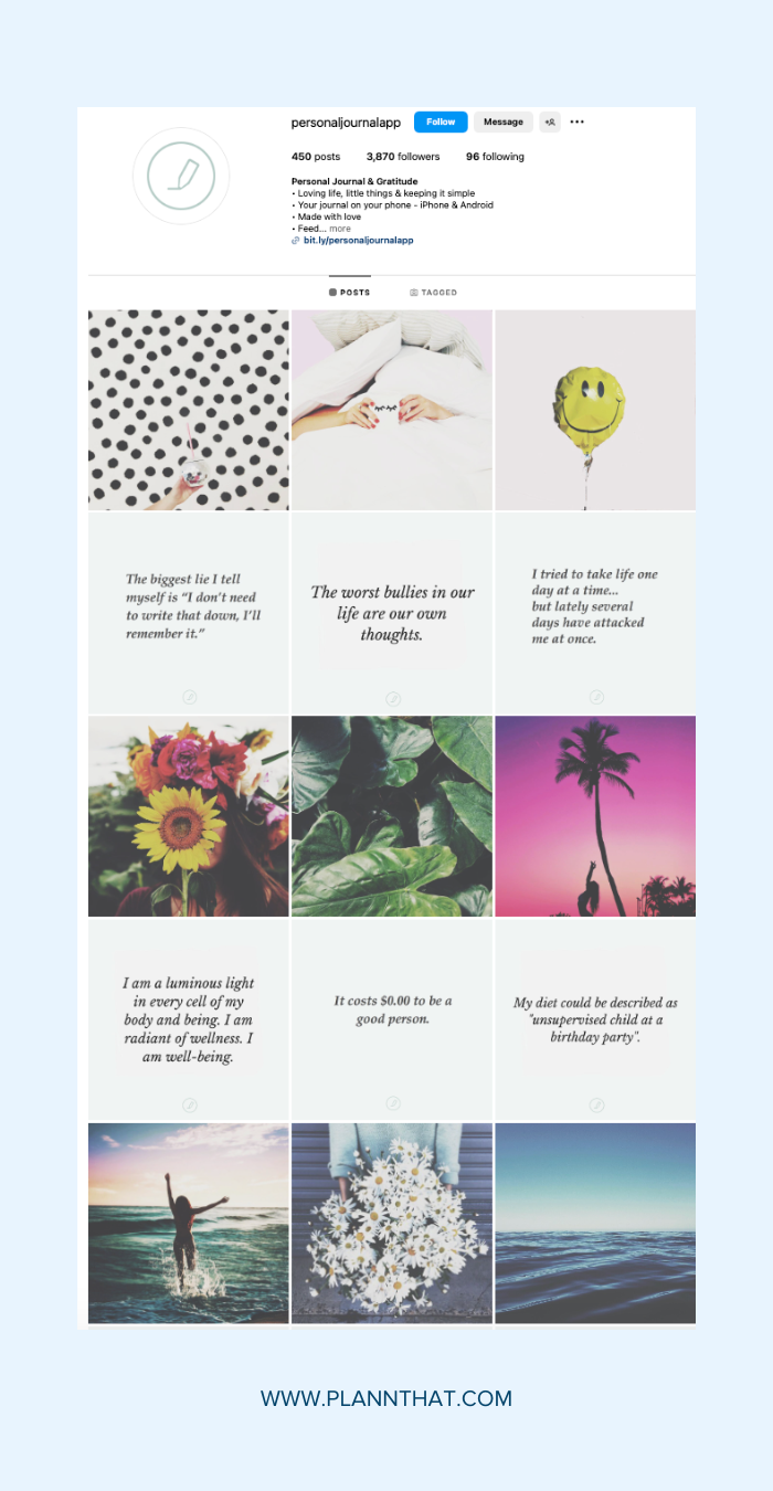
Horizontal lines Instagram grid layout
Want to give your Instagram profile a unique twist? Try a horizontal lines grid! This layout splits your photos into thirds, arranging them in a cohesive and visually pleasing pattern.
Start by choosing a color scheme or theme for your grid—it could be anything from monochrome to a rainbow palette. Once you have your theme, plan your posts in three sets, ensuring each trio shares a common element, like a location or mood.
Check out @personaljournalapp for inspiration. The brand posts three quotes followed by three photos to create a unique Instagram grid design.
Read More: What you need to consider before you start slicing and dicing photos for Instagram
3. Use Vertical Lines
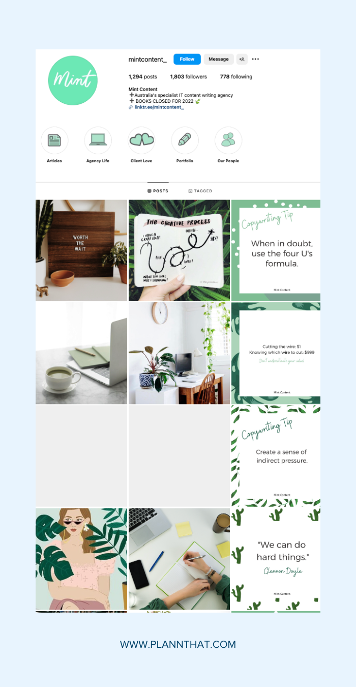
Vertical lines Instagram grid layout example
Creating a vertical lines grid on Instagram adds a sleek, modern touch to your profile. This layout involves posting a column of words or quotes vertically down the page, keeping visitors scrolling.
To nail this look, pick three styles of images and post them in sequence. As you post, they’ll each ‘shuffle’ across the page, and you’ll see that your ‘rows’ move from left to right.
For inspiration, check out @mintcontent_. The content agency posts a quote or a content tip in their brand colors to create the vertical lines effect.
4. Create a Puzzle
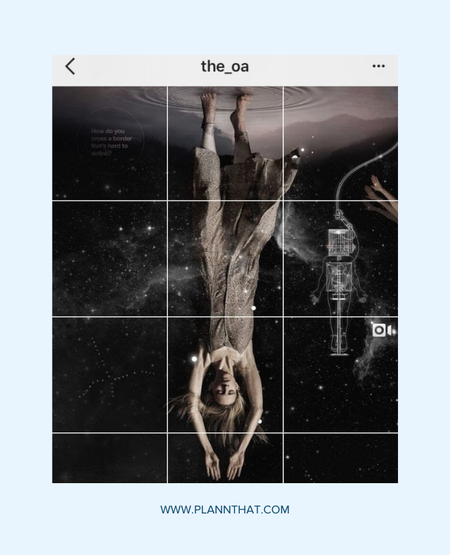
Create a puzzle effect with your Instagram grid layout
Looking to achieve some serious feed goals? The puzzle grid layout is your answer! This style involves splitting a larger image into 9-12 posts that, when viewed together, create a stunning, cohesive masterpiece.
Perfect for big campaigns or launching a new account, this layout connects photos across borders, ensuring each post stands alone beautifully while also contributing to the bigger picture.
For inspiration, check out this example from Netflix’s @the_oa. Remember, while tricky to pull off daily, this layout packs a visual punch for special occasions!
5. White or Themed Borders
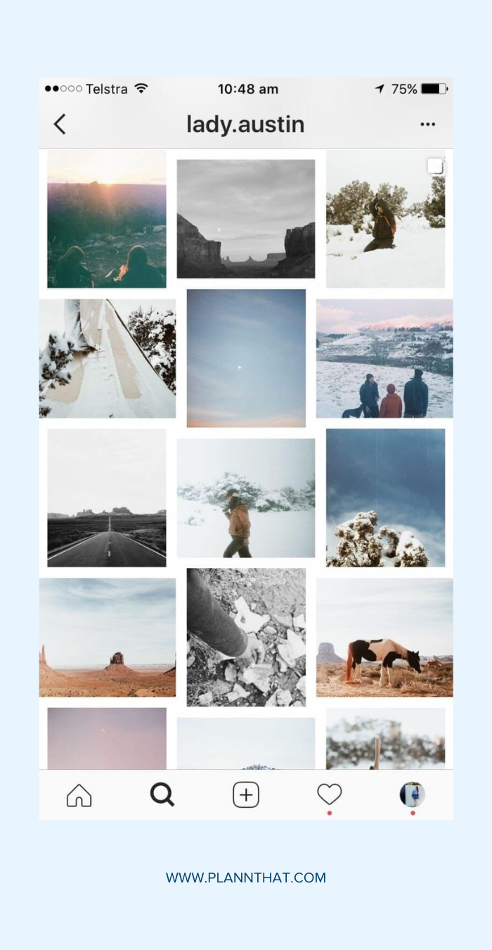
Add borders to your Instagram grid posts
For a touch of perfection, adding white or themed borders can create a captivating Instagram feed. Whether white, black or any color you fancy, borders make each photo pop without needing a complex strategy. Think of it as framing your favourite moments, bringing a polished, vintage-chic vibe to your Instagram posts.
When you pair it with a vintage filter, it creates a unique style like @lady.austin.
6. Rainbow Grids
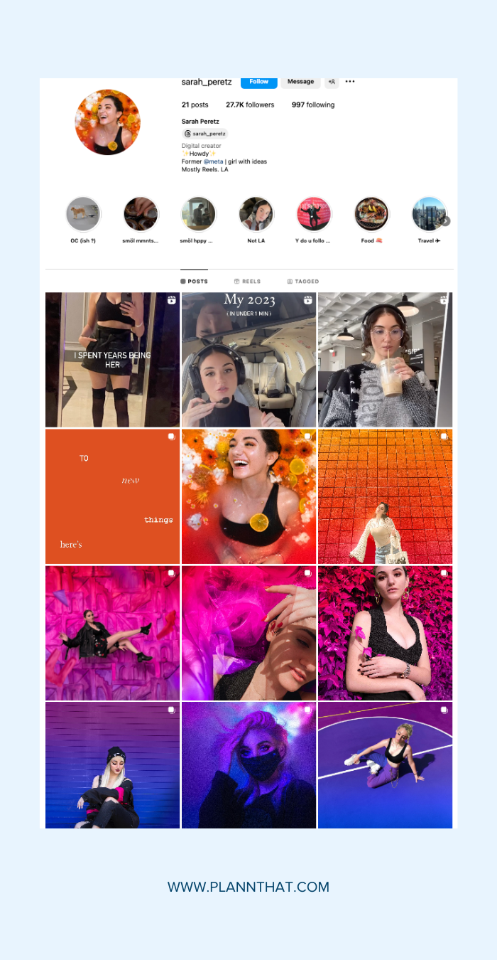
Create a rainbow effect on your Instagram photo grid
The rainbow grid layout is perfect for those who love color and creativity. To achieve this look, you’ll need patience and a keen eye for color.
Start by posting regularly in one saturated color and slowly transition to the next shade in the rainbow with your next rows of posts. Typically, you’ll use 3, 6, or 9 photos per color, connecting each row seamlessly. If you’re up for the challenge, the rainbow grid will make your profile stand out!
For inspiration, check out @sarah_peretz. She shifts from one color to another, creating a stunning palette transition.
7. User-Generated Content (UGC)
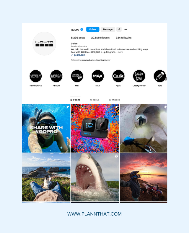
GoPro uses user-generated content to create their grid layout
Incorporating user-generated content (UGC) into your Instagram grid is a fantastic way to build community and showcase real-life engagement with your brand. Featuring your followers’ photos fills your feed with authentic content and encourages others to share their experiences.
For example, brands like @GoPro excel at featuring user-generated content and creating dynamic and engaging profiles that resonate with their community.
8. Create A Gallery
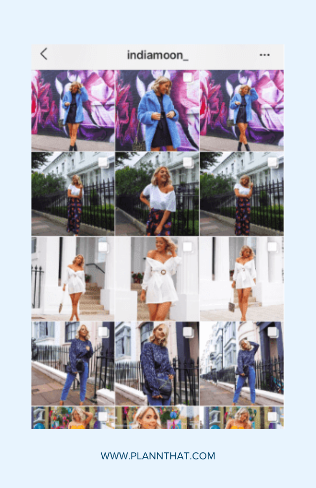
Create a gallery-style grid on your Instagram account.
If you are a blogger who shares outfit photos, a creative Instagram grid layout that you could try is a ‘gallery-style’ grid.
Share three photos (or three carousels like the lovely @indiamoon_) after one another to share multiple angles and close-ups of one outfit.
9. Go Diagonal
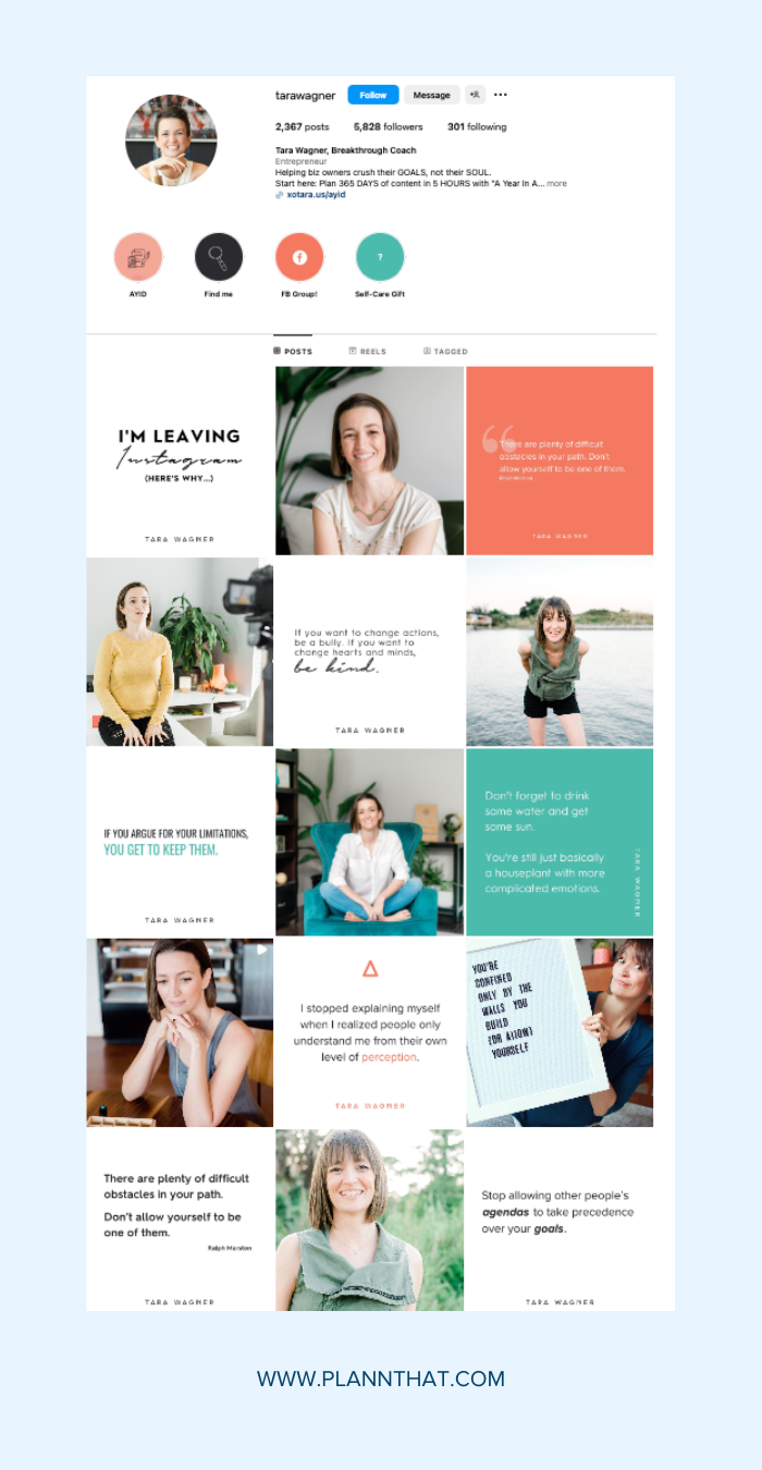
Diagonal grid layout on Instagram
The diagonal grid layout adds a creative and structured touch to your Instagram feed. Posting a similar photo (like a quote) every fourth post creates a diagonal pattern across your grid.
To maintain this look, plan your posts around color filters, backgrounds, or themes. This approach helps if you feel overwhelmed by endless posting options, providing a clear structure with four general themes. Choose themes that offer endless topics and tips to keep you and your followers engaged and inspired.
Need some inspo? Check out @tarawagner‘s diagonal grid layout.
10. Stick to a Specific Color Palette or Tone
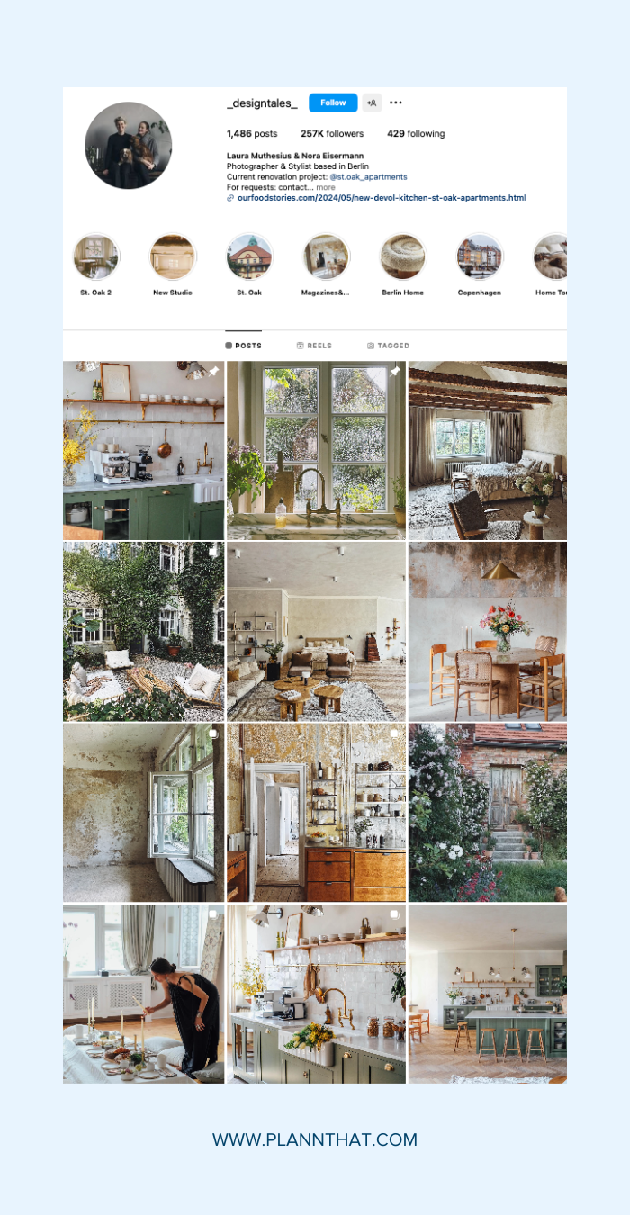
Use the same color palette for a cohesive Instagram grid
What is the easiest way to create a cohesive Instagram grid layout? Choose one filter, color scheme, or editing process and stick with it. Whether you go for pinks and greys or high-contrast neons, your gallery will look like it’s from the same “family”, even if the content varies.
Take inspiration from @_designtales_. Laura and Nora’s tonal theme on Instagram has a warm, desaturated vibe. They use lots of brown and warm tones to create cohesive and sophisticated feed.
11. Try Cohesive Typography
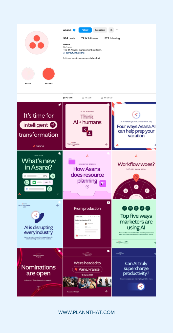
Try a text heavy Instagram grid layout like Asana
Adding typography to your Instagram grid can create a striking and stylish look. Regularly including text-heavy posts gives your feed a balanced, magazine-like feel, perfect if your brand is more educational than lifestyle-focused.
Check out @asana, which uses the same brand fonts and graphics across all its Instagram posts. This consistent look makes Asana’s brand memorable and creates an easy copy-paste Instagram grid template.
12. Use Your Brand Colors
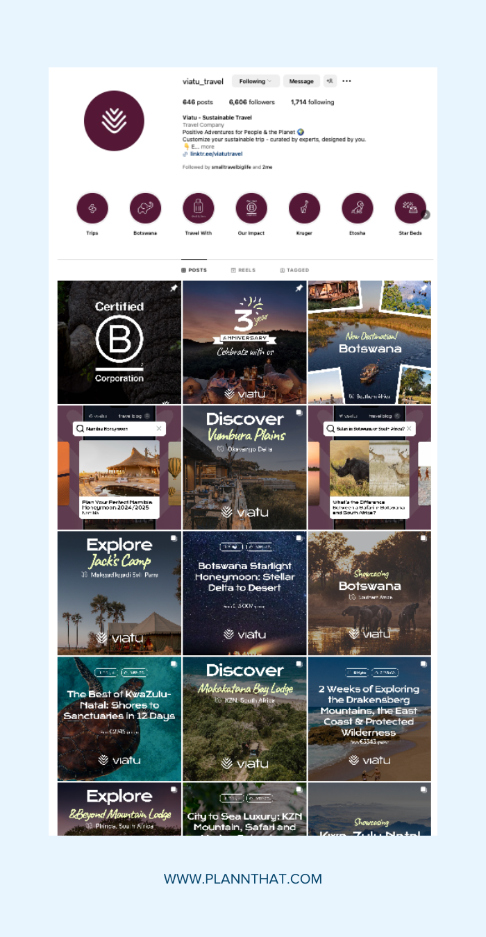
Use your brand colors to create a consistent look and feel on your Instagram account
Using your brand colors in your Instagram grid is a fantastic way to create a cohesive and recognisable feed. Unlike sticking to a vibe, this method showcases your brand’s signature color throughout your posts.
For the best impact, ensure your brand’s main color appears in almost every post. Look at how @viatu.travel uses its signature yellow and purple in its posts. This approach ties your feed together, making it instantly recognisable and visually appealing.
13. Use a Quote in the Middle
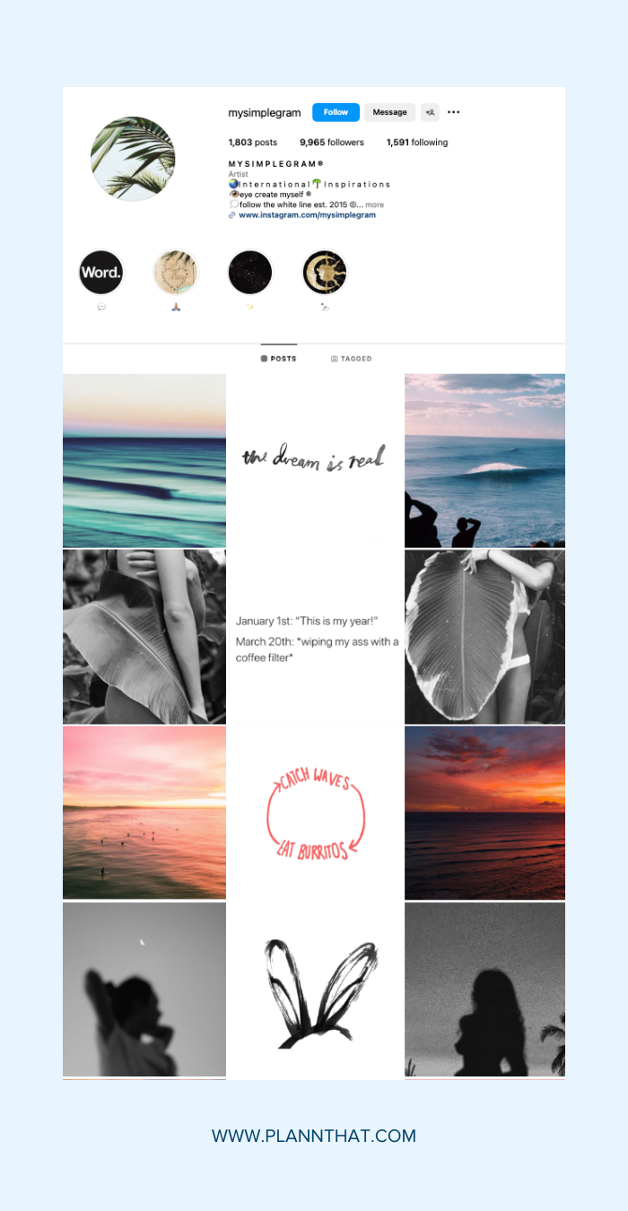
Add a quote in the middle of your Instagram grid.
For an easy-to-maintain Instagram grid, try filling the middle column (or row) with quotes while the rest of your grid contains photos. This grid layout creates a guiding line that leads viewers through your feed, encouraging users to keep scrolling and binging your content.
Typically, the quotes are on a white background, but feel free to get creative. When done right, this thoughtful arrangement can add depth and cohesion to your profile, making it beautiful and engaging.
One of the best examples is from @mysimplegram. The account only uses quotes on a white background and also makes sure the two photos on either side are the same color or black and white.
14. Educational Grids
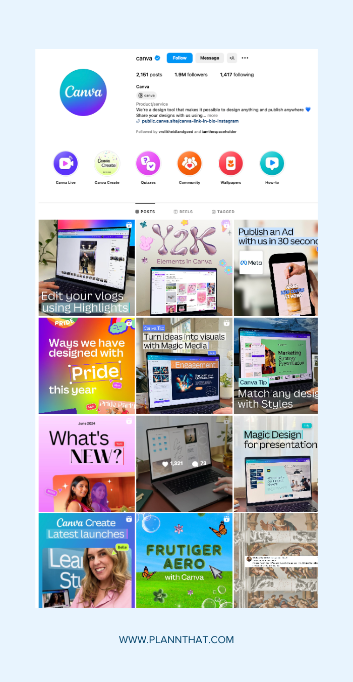
Create an educational look for your Instagram account
Creating an educational grid layout is a fantastic way to share valuable information while keeping your feed visually appealing. To engage your audience, use a mix of infographics, tips, and educational content.
To start, decide on a consistent format for your educational posts. You can alternate between visually rich infographics and text-based tips to keep things interesting. Brands like @canva do this well, offering practical advice alongside product updates and events.
Pro Tips for Creating a Stunning Instagram Grid
Cohesive Color Palette
Select a color scheme that aligns with your brand identity and maintains visual consistency. This unified look helps your feed feel more organised and makes your grid instantly recognisable. Stick to one or two primary colors and incorporate them into each post to create a harmonious flow.
High-Quality Images
Maintain a professional look by using high-resolution photos and editing them for a uniform aesthetic. Make sure each image is clear, vibrant, and ready to grab attention. You can grab free stock images from sites like Unsplash or invest a few hours on YouTube to learn how to take better pictures with your smartphone.
Planning & Scheduling
Use tools like Plann to visualise your grid layout, schedule posts, and maintain consistency. Planning ahead allows you to curate your content thoughtfully and make sure you’re nailing your overall aesthetic with each post without the stress of last-minute content creation.
Read more: Instagram Algorithm Update: How Rewarding Original Content Will Impact Small Creators
Bringing It All Together: Your Perfect Instagram Grid
Got your dream Instagram layout in mind? Great!
Let’s bring it to reality.
Sign up for a free 7-day trial of Plann Plus today and gain access to a grid planner, content scheduler, and everything else you need to win your social media strategy, like an AI-caption generator and weekly trending audios.
