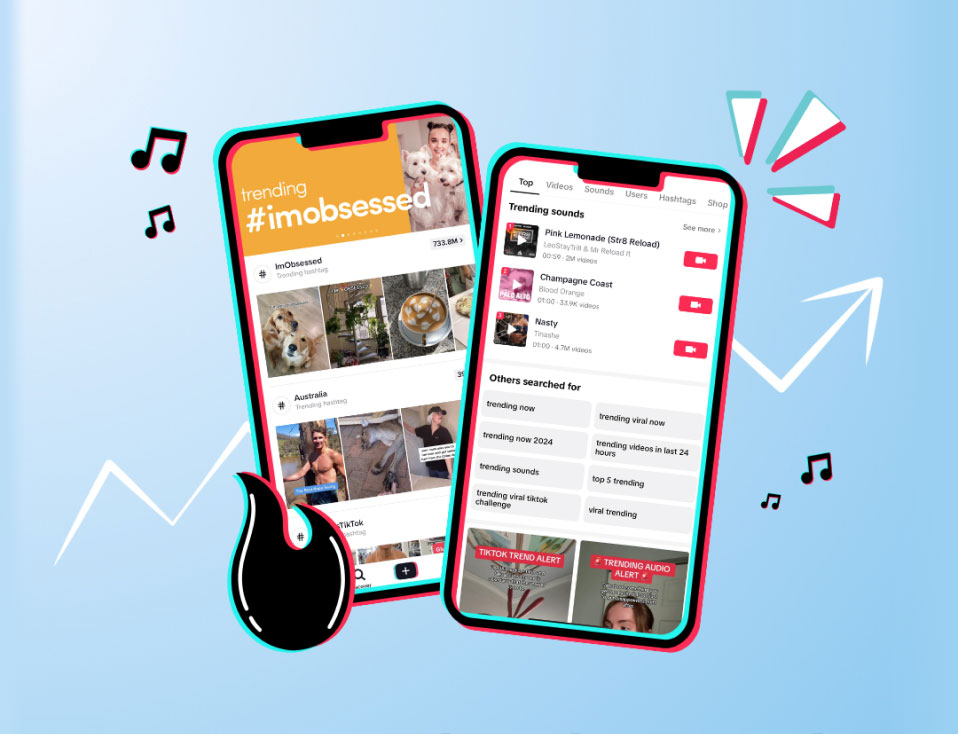
Let’s be honest, brand consistency can feel like an uphill battle, especially when you’re juggling 2+ social media platforms. With Instagram, Facebook, TikTok, and Pinterest all needing different types of content, how do you tie everything together visually?
With simple, yet effective image editing tips!
Whether you’re managing a presence on multiple platforms or one, you can use these tips to create instant brand recognition and achieve a cohesive look in minutes.
How to Keep Your Brand Visually Consistent Across Social Media
1. Use Presets and LUTs
Yearning for an aesthetic Instagram feed?
Invest in presets.
Presets are essentially filters you can use in applications like Lightroom. With a single click or tap, you can edit every image with the exact same settings.
It’s one of the easiest, cost-effective, and time-saving methods to achieve your brand’s cohesive social media look.
“But what about video?!” you might be wondering.
Introducing…LUTs!
LUTs are filters for videos.
To use them, you’ll need to have the correct video editing software to read the file. Once you have that, you can colour grade all your videos (YouTube, TikTok, Reels etc.) to have the same look.
Where you can buy presets and LUTs:
• The Preset Design
Before buying a preset or LUT, you need to keep your brand in mind. You can use a filter that encapsulates the look and feel of your business.
If your brand personality is light and whimsical, a dark, moody edit won’t match the vibe.
Once you’ve found an on-brand filter, commit to only using it. Don’t get shiny object syndrome and change your presets every week or month. The more you’re consistent with your look, the easier it will be to establish brand recognition.
Need some inspo? Check out, Katie Wilkinson.
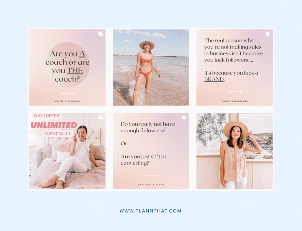
Her brand colours are shades of pink and peach. She edits all her content with a pink tone preset which creates a cohesive and aesthetic Instagram feed.
Psst… don’t have a lot of cash to splash on presets or LUTS? No worries! You can access filters for both images and videos, right inside Plann.
2. Create Reels Covers
When you upload a Reel, you can pick a cover image that will show up when someone sees your video in their feed or on your grid.
So, why should you create Reels covers?
1. It’s another opportunity for you to reinforce your branding
2. It can increase your views
Think of your Reel covers like a YouTube thumbnail. It’s someone’s first impression of your content. Your thumbnail can either repeal or entice a follower to tap and see more.
Worried Reels are going to make your grid look messy?
You can design your Reel covers in a way where it looks like a normal image on your main feed, but on the Reels tab, people can see the title of each video.
Case in point: Harley Jordan and Renee Roaming.
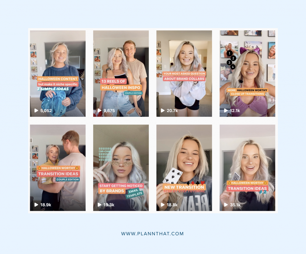
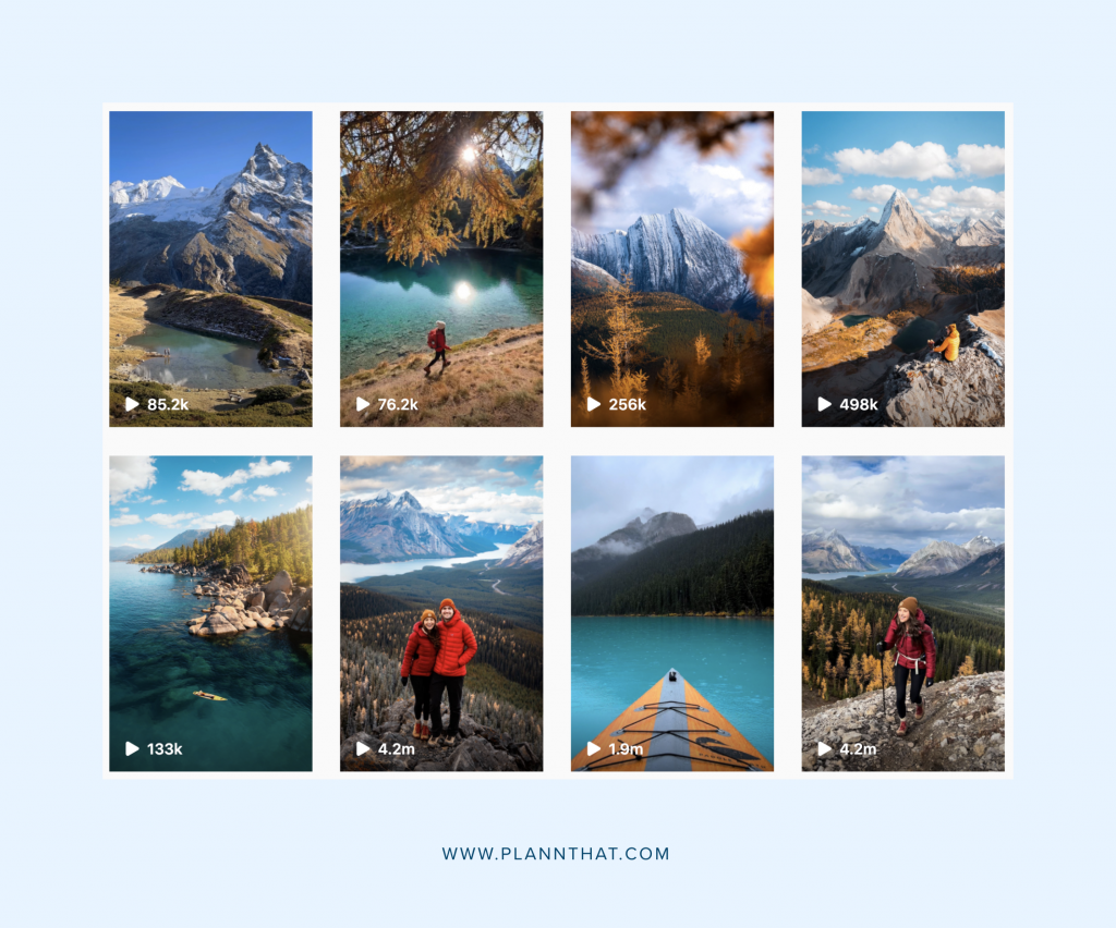
Again, you’ll want to design covers with your brand aesthetic in mind. Keep your colour palette, fonts, and design elements in line with what someone would find on your website.
Struggling to come up with designs? You can buy pre-made templates from Creative Market or use free Canva templates like these ones.
3. Use Your Brand Color Palette
Want a quick branding trick for tying all your content together? Choose a consistent color palette.
Brand colours are usually 3-5 shades that visually represent your company. These shades aren’t your favourite colors but represent a mood you want to evoke from your customers.
By using these brand colours consistently, you can increase brand awareness and recognizability.
Not sure what your brand color palette should be? Start with what’s already working for you! Head to the ‘results’ tool inside Plann to see what your best performing color palette is! You can even grab the HEX codes, so that you can add them inside Canva to get the exact right shade in your graphics.
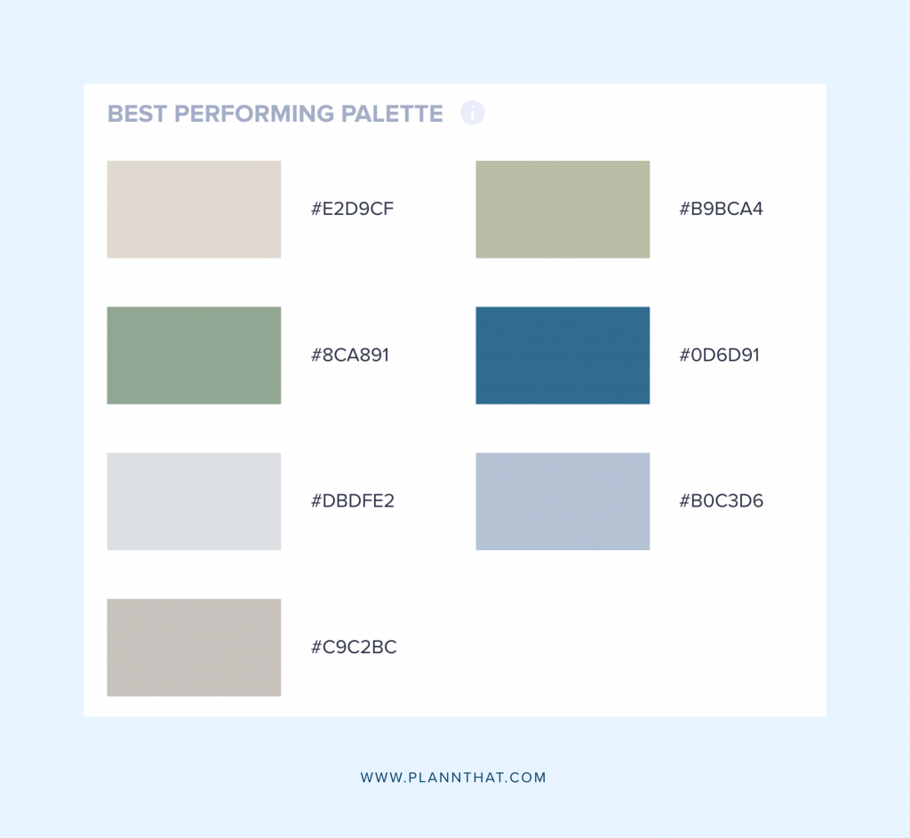
Once you have your brand palette locked in, start incorporating the shades into your content.
For example:
• Create Instagram Highlight covers using the shades
• Buy clothes that match the color palette and wear them in your photos and videos
• Use on-brand decor items in the background of your content
• Find your brand colors in the real world and shoot content there, e.g. a pink or blue wall
• Save your brand colors in Canva to include them in your graphics
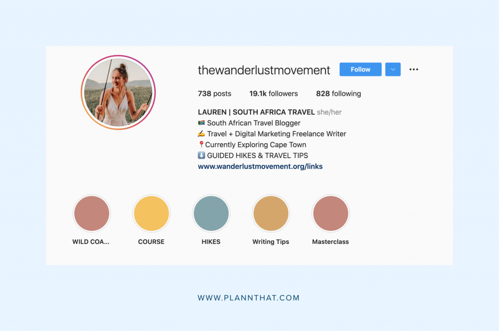
Repeating the same color scheme will naturally tie all your visuals together by creating a common thread across your social media channels. Your followers will begin to associate these colors with you, and your social media platforms will look like a continuation of your brand.
4. Stick to Your Brand Fonts
Your fonts are a big part of your brand’s personality.
Running a super feminine antique shop? Use a romantic script.
Launching a fitness brand? Choose something bold and simple.
But your fonts shouldn’t only exist on your website.
While you can’t control the font options on Instagram or YouTube, you can control the graphics you create.
Using your brand fonts on your YouTube thumbnails or Facebook page banner, you can create a memorable online presence and keep your posts on each channel different but cohesive.
Here are some font resources to help you find the best script or sans serif for your brand:
Decide on 2-3 brand fonts and upload your choices to Canva to streamline your content creation process. Or, use our text editor tool inside Plann to instantly access professionally-designed fonts and create graphics with them!
5. Use Templates
Templates are the secret sauce to creating aesthetic and cohesive content in under five minutes.
Instead of spending hours browsing different options, you get to simply copy and paste.
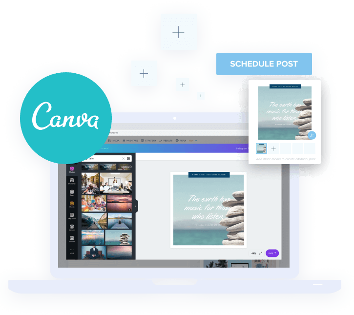
Canva is one of the best apps out there for this process. It comes with hundreds of pre-made templates for every single social media network. You then have the option to resize any graphic into new dimensions.
For example, let’s say you found a template you love for your Instagram quotes but want to re-use for Facebook. Click on the ‘resize’ icon, choose the social media network, and voila!
Canva instantly re-sizes the template to a Facebook post
The best part is, you can link Canva to your Plann account, so you can instantly access and customize templates while planning your social media content.
Some of the content you’ll want to create templates for include:
• Pinterest pins
• LinkedIn, Twitter, and Facebook banners
• Instagram Reels and IGTV covers
• Instagram Highlights
• YouTube thumbnails
• Instagram Stories
6. Use Plann’s next-level editing tools
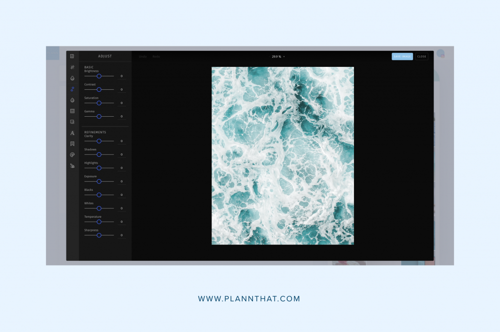
Did you know that you can access a suite of user-friendly image editing tools right inside Plann? When you’ve got an image selected on your grid, just click on the little magic wand to pull up our editing menu. You can do everything from adjusting the brightness and contrast of your images, adding filters to make them look consistent and even adding a text overlay to create graphics!
We’ve even added some brand new updates to take your editing to the next level:
– NEW: Editing ‘adjust’ tools to change brightness, saturation, lighting and more
– NEW: Creative overlays to add effects to your images
– NEW: Line spacing option for text, to ensure it’s perfectly even
– NEW: Even more font options for text.
– NEW: Text design ‘move to front’ option
Log into Plann or create your free Plann account today to start experiencing the editing magic!

