Like a TV advertisement requires punchy slogans and consistent messaging, so does your branding strategy for social media.
With 93% of businesses increasing their investment in social media for marketing purposes, building a brand aesthetic that’s instantly recognizable and consistent across multiple channels has never been more important.
It’s why you’ll instantly recognize Go-To Skincare’s pastel pink posts or why you’ll always link emotive images of runners in the great outdoors with a Tracksmith campaign. With studies suggesting brand consistency on social media can increase revenue by 10% to 20%, creating a visual identity on social media has never been more important.
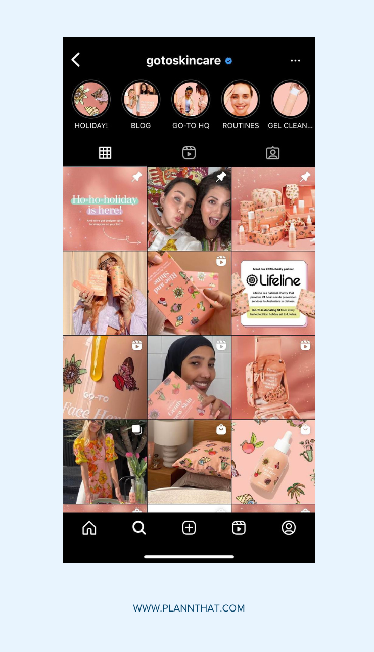
With a carefully considered aesthetic, brands big and small are able to rise above their competitors and reach a wider audience. But while you might think all this involves is curating a nice selection of images, the key actually lies in consistency across visual storytelling, font selection, color palette, and tone of voice to ensure all posts reflect your brand’s vision.
Curious how you can build a strong brand aesthetic on social media? We’ve got five strategies that will ensure you increase brand recognition on social media to drive customer engagement and loyalty.
What is a brand aesthetic on social media?
Ever scrolled through the Instagram feed of your favorite activewear brand and marvelled at their stunning grid? That’s the power of a strong brand aesthetic.
In our increasingly visual world, brand aesthetic refers to the overall design and online experience of a company or business. It’s the hook that encourages audiences to recognize and remember a brand. According to recent research, consistent branding can even increase revenue by 23%.
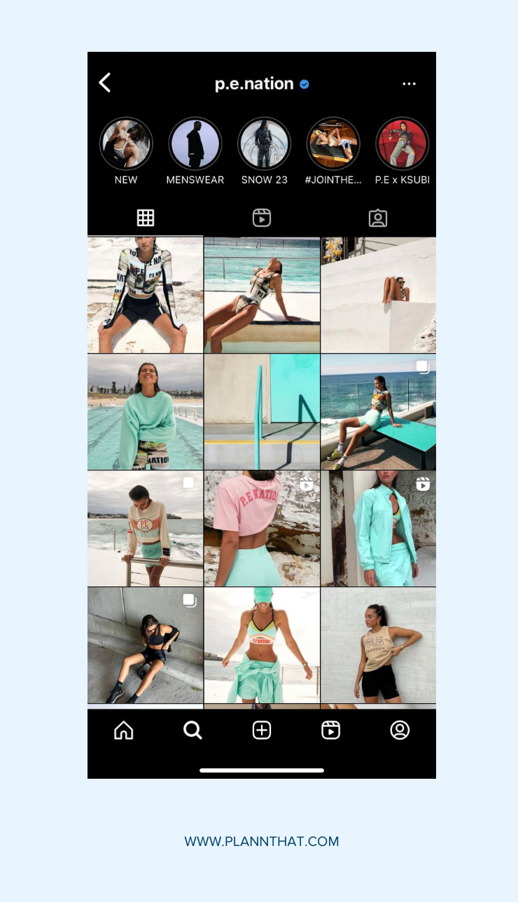
Take P.E. Nation, for example, with its urban street-style photography and distinctly sporty feel. To view its social media aesthetic is to understand the core values of the brand: stylish, contemporary, with a passion for movement.
As a small business, your brand aesthetic should reflect your brand identity: are you playful or quirky? Is your business strictly professional, or do you operate on sharing humor and witty puns? Knowing your core values and target audience can help determine your aesthetic and position your brand as different from other competitors on the market.
Aesthetics drive engagement on social media, so creating one that is recognizable and consistent across the board is imperative. This means establishing brand consistency online using handpick fonts, colors, imagery and even a recognizable tone of voice.
What makes for an effective brand aesthetic?
With so many brands competing for attention, those that inspire audience engagement all convey a brand’s identity and intended message.
When it comes to visual storytelling for brands on social media, make sure you:
• Consider the audience: Curate your brand aesthetic to appeal to your ideal customer’s demographic. While a Gen Z makeup brand might harness bright, playful colors, a more refined brand like Colleen Rothschild favors more monochromatic tones to reflect its sophisticated audience.
• Present a cohesive visual: Across all social media platforms and content placements, ensure the typefaces used, style of photography, and brand colors are consistent to build recognition with audiences.
• Employ a consistent tone of voice: Most might consider photography to be the key to curating a strong brand aesthetic, but equally as important is how you communicate with your audience. What’s your tone of voice? Are you informative, educational, or humorous? Like your typography and imagery, this needs to be consistent across the board.
Take this example of Christy Dawn, a brand whose ethos is grounded in sustainability. Across their social media platforms, you’ll find images in an earthy color palette that celebrate nature. The brand’s captions draw on the same emojis that are written in a tone of voice that balances the aspirational with the educational.
Ready to supercharge your brand aesthetic? Here are five strategies to help you create one that’s instantly recognizable while remaining true to your vision and values.
1. Conduct customer and competitor research
Your audience should be the focus of your brand aesthetic. That’s why it’s worthwhile asking them for feedback when developing your visual aesthetic on social media. Their insights can guide you on the audience experience and how your brand aesthetic caters to their needs.
Running polls on Instagram Stories or hosting focus groups with loyal customers can help to inform the decisions you make around colors, fonts and brand photography.
You can also do an audit of your competitors on social media to find any gaps in the market or ways to set your brand’s visual identity apart.
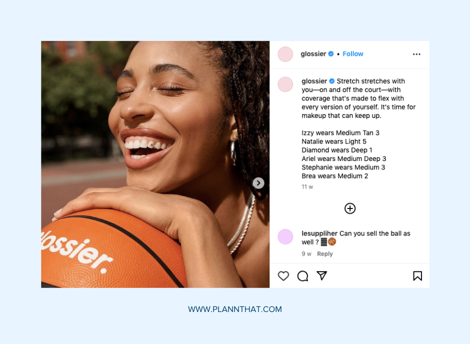
For example, the pioneering makeup and skincare brand Glossier celebrates natural beauty (unlike many other makeup brands that are focused on bold, glamorous looks). From bare-skin photography to personable captions, their brand aesthetic is one that leans into this philosophy of embracing your true self.
Ultimately, content always comes back to the consumer and their needs and when it comes to designing a brand aesthetic, it’s important to consider what will resonate with the target audience.
2. Curate a branded color palette
A branded color palette refers to the colors used across all your marketing, including your website, social media, and packaging.
Ever wondered why McDonald’s has the famous red and yellow branding? Turns out red makes you hungry. In the same manner, certain colors have the ability to impact consumer behavior. According to research, 85% of customers’ purchasing decisions were influenced by color psychology.
So, how do you land on a branded color palette? The key is to stick to a few colors and not overdo it. Too many colors will overwhelm audiences, so select up to three colors that you can apply consistently across your marketing materials and social posts.
Consider using a color wheel to determine how you can combine colors. Do you want them to be complementary or contrasting, bold and bright or more subdued and elegant? The colors you choose should appeal to your target audience and reflect your brand identity.
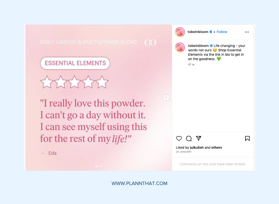
For example, INBLOOM favors a pastel color palette reflected in its packaging on social media. You’ll see the same colors of pink, purple, green, and yellow used in its Stories and feed posts, with each relating to a particular product.
In contrast, Made Of uses an earthy color palette and pairs them against a neutral background, bringing a sense of unity to their social media designs.
3. Use templates to show up consistently
Consistency is key to creating a strong brand aesthetic, but achieving this is no easy feat. Thankfully, creating templates will not only ensure your aesthetic is applied consistently but also save you time and effort.
Templates allow you to speed up content creation and beat creative block with plug-and-play visual templates ready for you to repurpose time and time again.
Take this example from the activewear brand Bandier, which ensures consistency with new product launches by using a template that sees them dissect a product’s features in an easy, digestible way.
Did you know Plann’s integration with Canva allows you to design and build branded templates with ease? Show up consistently on social media and never stray from your brand guidelines again with templates that can be repurposed for months to come.
Expert tip: Before starting your template creation, make a mood board to drive the visual direction of your brand aesthetic. Whether it’s a physical mood board or a digital Pinterest board, gather reference images, ad campaigns and other social media posts that you can draw inspiration from when building out your own social media templates. Always remember to tailor these templates to your own branding!
4. Harness visual storytelling with original content
Visual storytelling is about communicating your brand’s vision, value and identity through your content.
When it comes to rising above your competitors, you need to create striking, original assets. Move away from generic stock imagery and prioritize shooting and creating your own photography and video content that’s unique and tailored to your audience. Take the brand Dyspnea for example, which frequently uses user-generated content and selfies that are in keeping with their brand’s fun, playful aesthetic.
For small businesses, this doesn’t mean you need to invest in a studio space or coordinate with a photographer and lighting crew. Using your smartphone, you can create high-quality content with the help of photo and video editing apps like VSCO and Lightroom.
5. Curate a unique tone of voice
It might not be the first thing that comes to mind when thinking of brand aesthetics, but how you communicate with your audience in your captions is critical when it comes to gaining their trust. Your brand’s tone of voice should work seamlessly with your imagery to ensure cohesion with your visual content.
Take Fenty Beauty as an example. With its young audience, the beauty brand chooses to communicate in a playful manner, with captions that are conversational, filled with slang and emojis you’d expect to see in a WhatsApp exchange with a friend. In contrast, Chanel Beauty is much more formal in their tone of voice and never uses emojis in their captions.
When deciding on a tone of voice, consider your overall brand identity and values.
• Are you looking to entertain or educate?
• Are you wanting to position yourself as an industry expert or reflect a fun vibe that attracts a Gen-Z audience?
Need a hand? Plann’s AI Caption Generator is a useful tool when it comes to perfecting a tone of voice for your brand. By entering details about your post idea, our AI Caption Generator will ensure consistency by crafting high-performing captions in keeping with your brand identity.
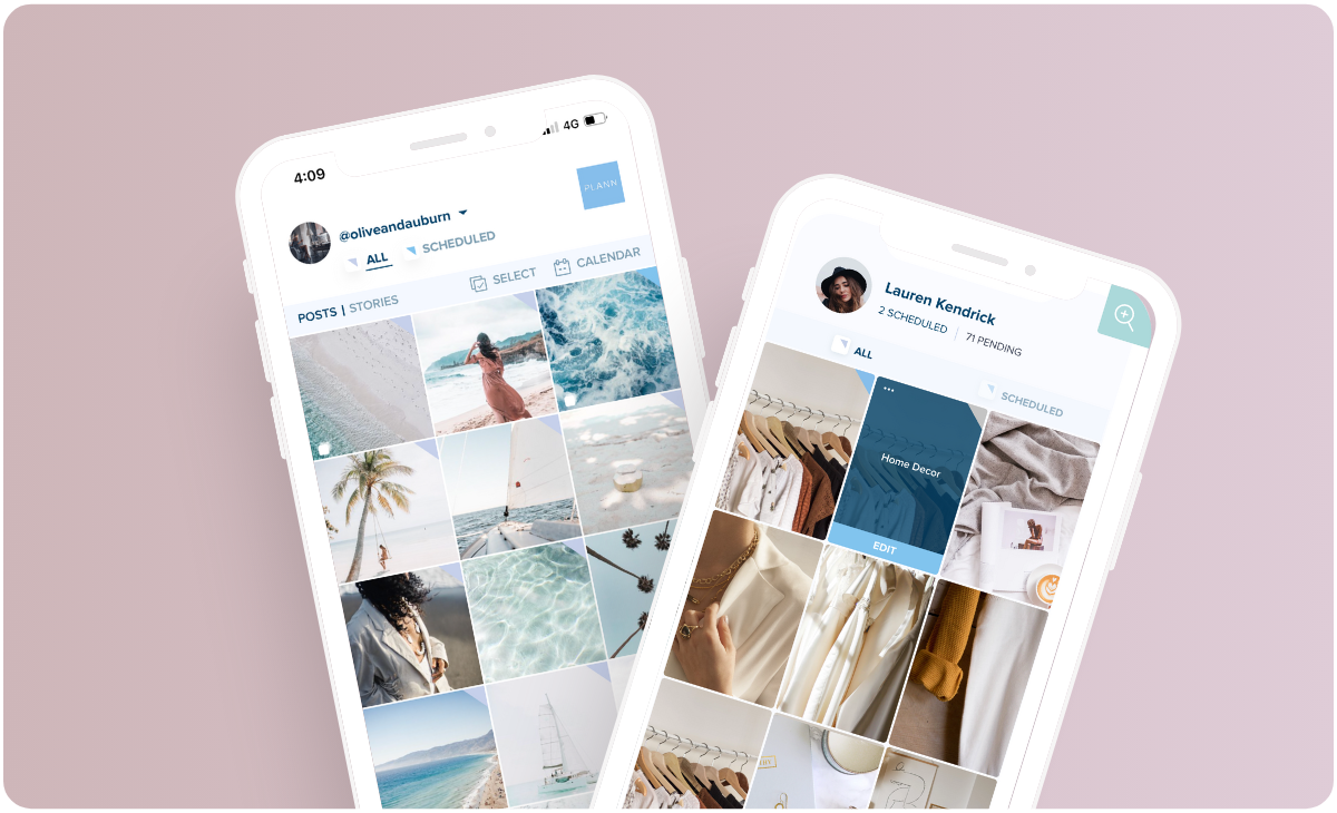
With all these tips at your disposal, it’s safe to say you’ll have amplified your brand’s social media aesthetic in no time. With Plann’s visual content planner providing a bird’s eye view of your calendar, you’ll be able to map out your posts across social platforms to ensure consistency is maintained throughout.
Go on, and redeem your 7-day free trial of Plann Plus. If you don’t like it, keep using Plann for free!
