If you are struggling to master the art of creating a consistent Instagram theme, this blog is going to bust down the door and reveal one of the most helpful secrets you’ll ever learn.
OOOooOOoOOOoOOo
I am not joshing around here (sorry Josh!) this one tip makes the struggle of pairing photos and videos together on an Instagram grid as easy as pie.
Take the struggle out of Instagram scheduling and learn how to create a consistently beautiful Instagram theme.
Let’s jump right in!
MY #1 INSTAGRAM HACK
Something that I teach in real-life, Instagram Marketing workshops is the technique of creating an Instagram grid that follows your branding color theme.
This type of Instagram theme works well for people that run an Instagram account for:
– A service-based or SaaS business
– A blog or hobby
It is one of the easiest ways to create an Instagram grid theme that is always stylish, flows visually and is actually achievable.
As an app with the dominant brand color of ‘blue’ our Plann Instagram account looks like this:
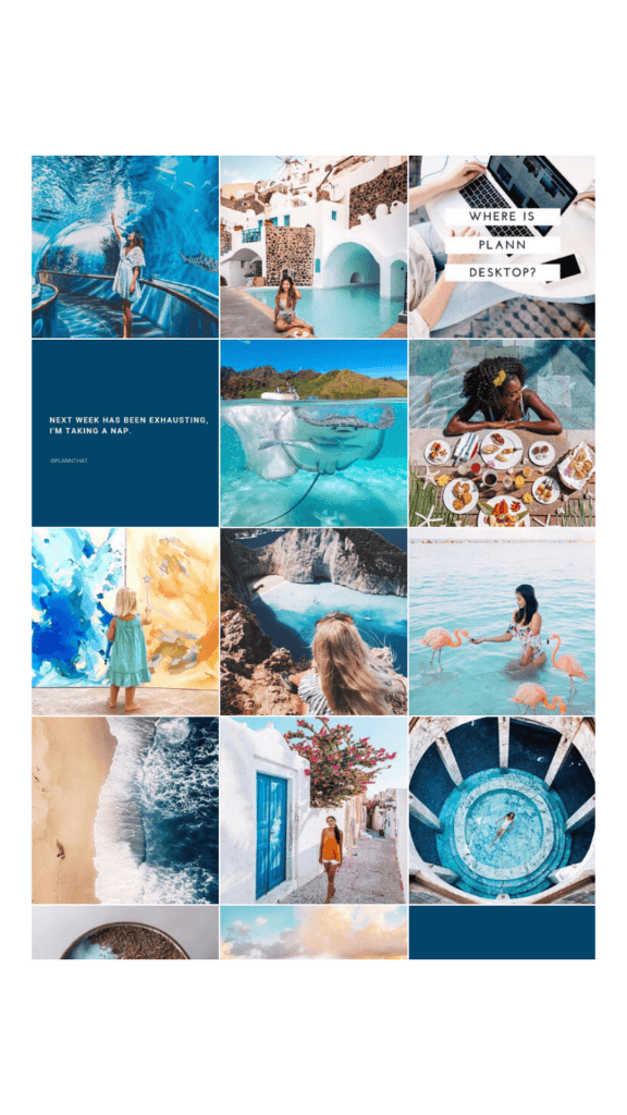
While all of the images we share are very different, they flow visually because we have made sure that the color blue features at least once in every single post. It doesn’t matter that sometimes an image will have the color pink, yellow or red as long as blue is somewhere to be seen.
Want to see this in action? Scroll down for more!
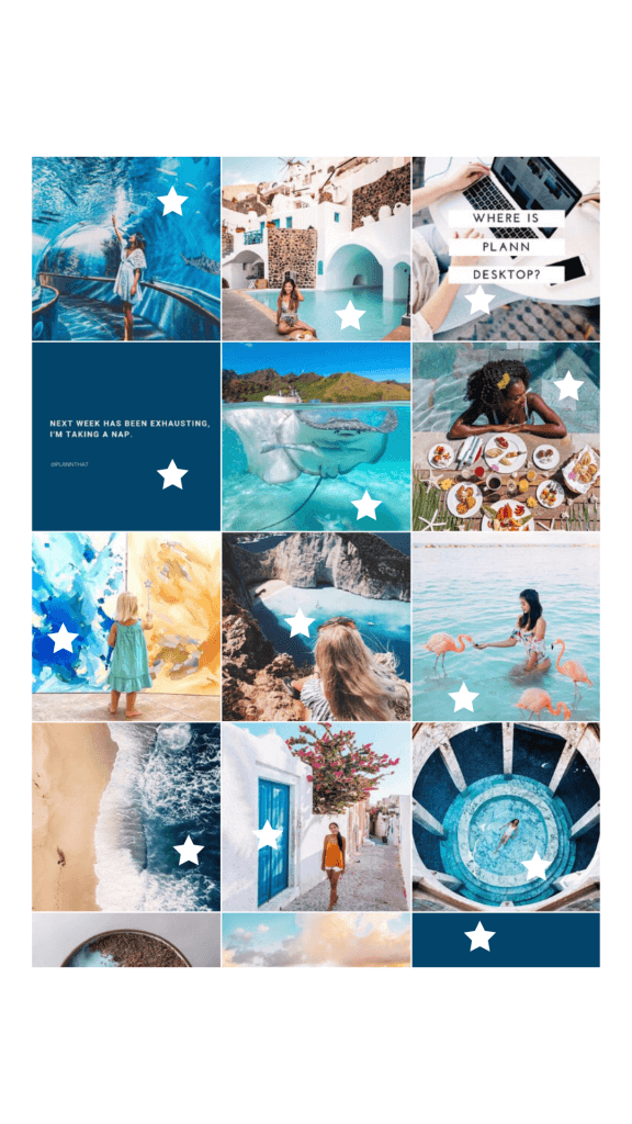
As you can see here, i’ve highlighted with a star where the color blue features in our previous posts. You can see that while the shade of blue changes slightly, they are all in the same ‘family’.
Although we don’t add a filter to any of the images we share to Instagram (that we repost) we often get asked if we do.
Why is that?
If I had to guess, i’d say that the reason why people think we use a consistent filter on all Plann posts is because we carefully choose images that feature a similar shade of blue and we pair them up next to each other inside the Plann app before posting to make sure everything flows.
By using this technique, even if you aren’t a service-based business or a blogger, you may find that it becomes easier for you to decide what to post and when.
Plan out your grid on desktop
The second part to creating a consistent Instagram theme is of course, planning out and scheduling your Instagram content so that you can stay on track!
We designed the Plann app to help people just like you to create visually stunning Instagram grids without the hassle of making a Finsta (fake Instagram profile) to post your content to before actually posting. Woohoo!
Upload or repost images directly into the Plann app and from there, drag and drop your content until you’ve created a grid theme that you love.
Need more help designing your Instagram grid?
Want some more tips on creating a consistent Instagram theme? No worries!
I know that while this technique is really helpful for a lot of people I speak to, it isn’t going to be the perfection solution for errrybody.
Luckily we’ve written a bunch of helpful blogs with tips on how to create a variety of different Instagram grid themes that you can use to simplify your visual strategy.
Keen to get started on your jaw-droppingly awesome and oh-so consistent Instagram theme? I sure hope so!
If you loved this blog be sure to share it with a fellow Instagrammer for 10,000 karma points.
Oh and don’t forget to head on back around to see us the next time you have an Instagram question. We write new blogs every week so there’s always something new to learn.
