So you’ve set up shoppable Instagram images. Now it’s time to Shopify your Instagram feed. This is a key step in many brands’ monetization schemes, and the only step for many. Naturally, you’ll be rewarded if you do this well. Let’s take a look at some creative ways of using shoppable Instagram feeds.
Up until this point, one of the most difficult parts about operating a business on Instagram has been the inability to tag products within posts. With this new functionality, your business can easily connect your followers with the products you sell.
 Let’s break down some of the basic traits of a post in a shoppable Instagram feed.
Take, for example, this post by @twodeckbrand.


As you’ve seen, when a product is tagged in a shoppable Instagram feed, a viewer will see a bubble prompt in the bottom left corner. If they single tap the picture, the product tag appears in the same familiar speech-bubble style as @tags.
Note that single tap gesture — that means if someone double-taps to like a photo, they will see the tag. That means if someone likes your photo, there’s already a good chance they’re going to see your tag, which is obviously required for them to make the purchase.
What tip can we take away from that little peek into the way tags get revealed? This: that you’ll benefit if you focus first on good content. If someone clicks to “Like” a post in your shoppable Instagram feed, they’re also revealing your shoppable tag… and you’re already halfway home.
Beyond that, tagging products in a shoppable Instagram feed presents new visual elements that you can cleverly play with. Think along the lines of a photo of a person making a heart shape with their hands, and positioning those hands in the center of the frame, roughly outlining the iconic heart that appears when you “Like” a photo.
For fun and inspiration, we gathered some appealing shots from some shoppable IG feeds, below.
How to Use Shoppable Instagram Feeds
GlitterGirl
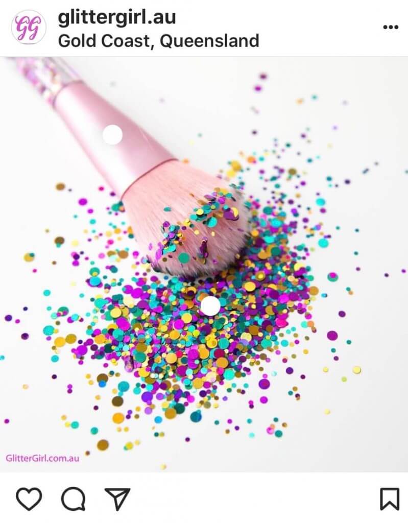
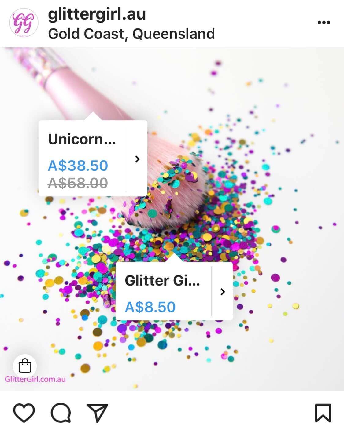
This photo is definitely eye-catching. Why does it work so well in a shoppable Instagram feed? First, notice that the watermark is right near where the “Tap to View Products” prompt will appear. This is excellent economy of space. There are already two product tags competing for screen real estate, and those plus a shopping prompt and a watermark might be a bit congested for a precious square segment of your phone screen.
Beyond that, GlitterGirl – @glittergirl.au – is following the normal visual branding best practices. The photo pops with an impossible to miss mix of on-brand colors. The white background helps accent the vibrant product display. This is a girlish, trendy, stop-and-scroll-back-up-to-look type of shoppable Instagram feed.
Tanouk Apparel
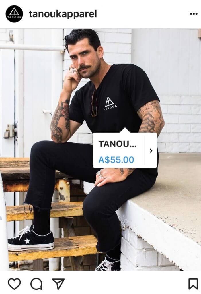
Next, look at this photo Tanouk’s shoppable Instagram feed – @tanoukapparel. More masculine to match their targeted demographic, plenty of white space, limited color spectrum. It goes to show you that you can still stand out, even without bright, saturated hues.
What may also be working for this post is the inclusion of a person is an engagement-booster and thus, qualifies as Instagram best practices. The model likely appeals to their stylish masculine audience.
But what about the product tag? Here, we’re confronted with a small aesthetic dilemma. When the product occupies such a great amount of the screen, where do you put the tag? Tanouk opted for near the logo, but not right beneath. The tag itself is more or less front and center on the screen, but offset just a bit to cover as little of the model as possible.
Temples and Markets
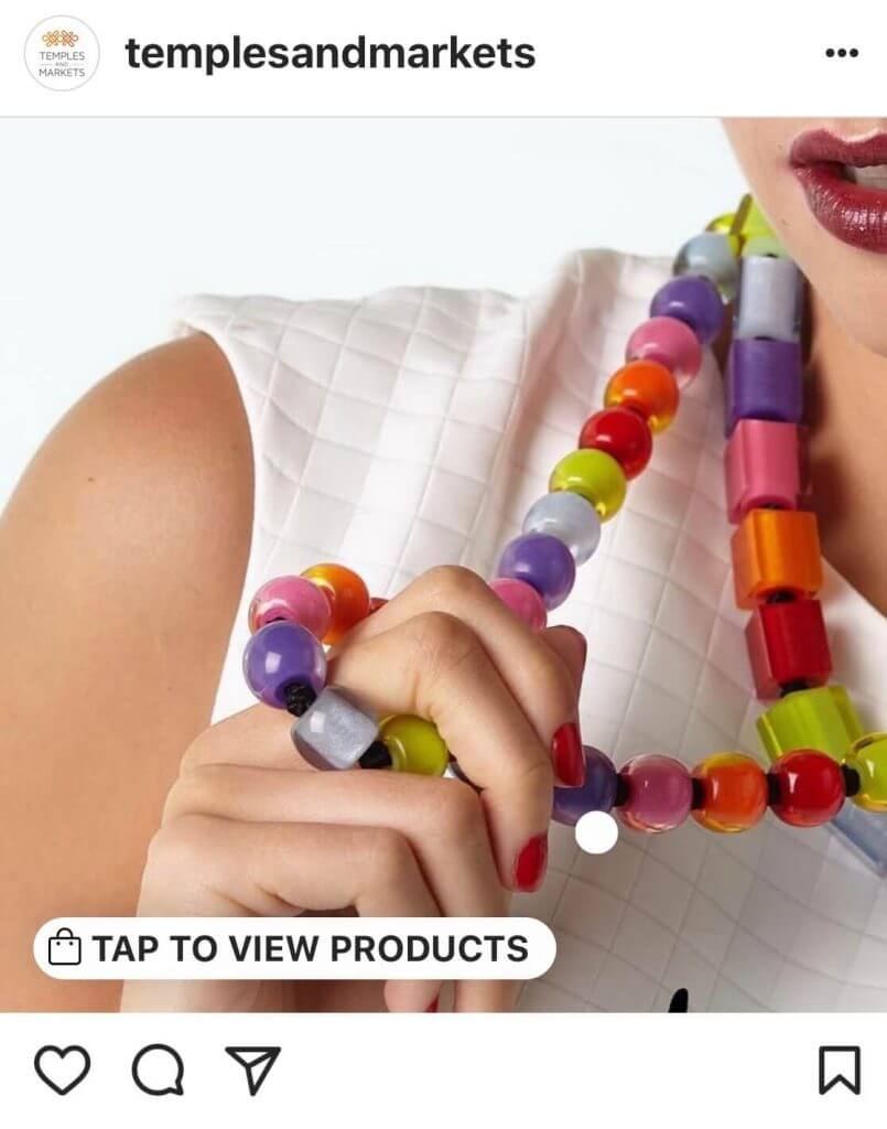
Here Temples and Markets (@templesandmarkets) reminds us that sometimes it’s perfectly okay to show off. If you’re short on inspiration for your shoppable Instagram feed, feel encouraged to simply let the product speak for itself.
Lucas Loves Cars
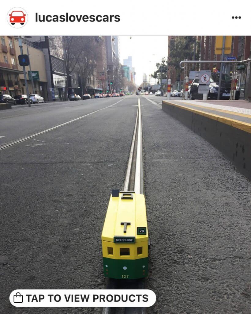
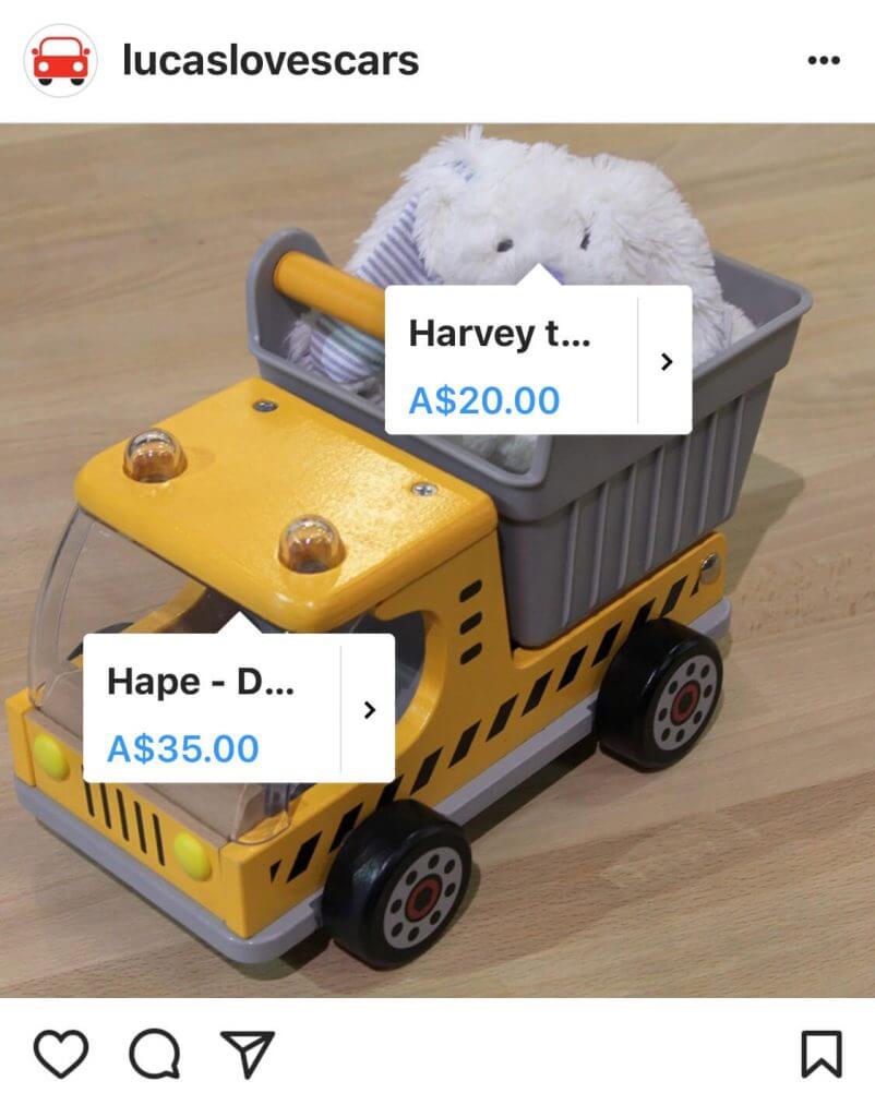
Lucas Loves Cars – @lucaslovescars – accomplishes a lot with their shoppable Instagram feed. First of all, they sell toys for young children. Look at the image on the left — not the kind of photography you expect from baby toys. If it weren’t for the CTA at the bottom, we wouldn’t have even guessed this post was promoting a product.
Remember what we said at the beginning? If you can get someone to like your photo, you’re halfway to accomplishing the goal of a shoppable Instagram feed. Great photography is, of course, the backbone of Instagram, and a photo this clever will earn the attention of your followers.
The second image illustrates another tack you can take with your shoppable Instagram feed. This post is actually promoting a giveaway. The truck and the bunny are the prizes. Here the shoppable image isn’t meant to drive sales but rather meant to add context and impulse to the contest. And it worked to great effect! They got hundreds of entries and received massive engagement on this post.
[clickToTweet tweet=”Discover creative ways to use #shoppable #Instagram feeds. #Plann ” quote=”You want sales from your shoppable Instagram feed, not just likes. So take care to make make it good. “]
In Conclusion
It’s exciting to have this new functionality at last, and it will change the day-to-day of many brands. It will definitely highlight Instagram as an increasingly important platform for more retail businesses. If you’re thinking about getting into the game, take the time to research many companies — including your competitors — who are doing it well. Get feedback as you go and refine, refine, refine.
Download Plann for iOS and Android to edit your images, develop and store your ideal hashtag sets, and to keep your shoppable Instagram feed organized.
