We all know that a visually appealing Instagram grid is the key to gaining more followers and increasing your Instagram engagement. But how do you design your Instagram grid on a desktop?
It can be frustrating when you’ve uploaded images from a DSLR to your laptop, edited a few things in photoshop and you’re ready to go but you don’t have an easy way to design your Instagram grid on a desktop.
Watch: How to design your perfect grid on a desktop
Say goodbye to the frustration and say hello to the easiest way to design the perfect Instagram grid on a desktop computer.
What is it? It’s called Plann, and it’s totally going to change your Instagram game!
How To Design Your Instagram Grid On A Desktop
Choose Your Content Themes
Your perfect Instagram grid starts with choosing your content themes, which should be based your niche, industry, and audience. The good news is, we’ve got just the thing to help you figure these out! Living inside the ‘strategy’ section in Plann, our content prompts are pre-designed strategies for 50+ different industries. Find the perfect one for you, then click to have it added to your grid. This will guide where your content needs to go, so all you need to do is fill in the gaps.
Fill In The Blanks
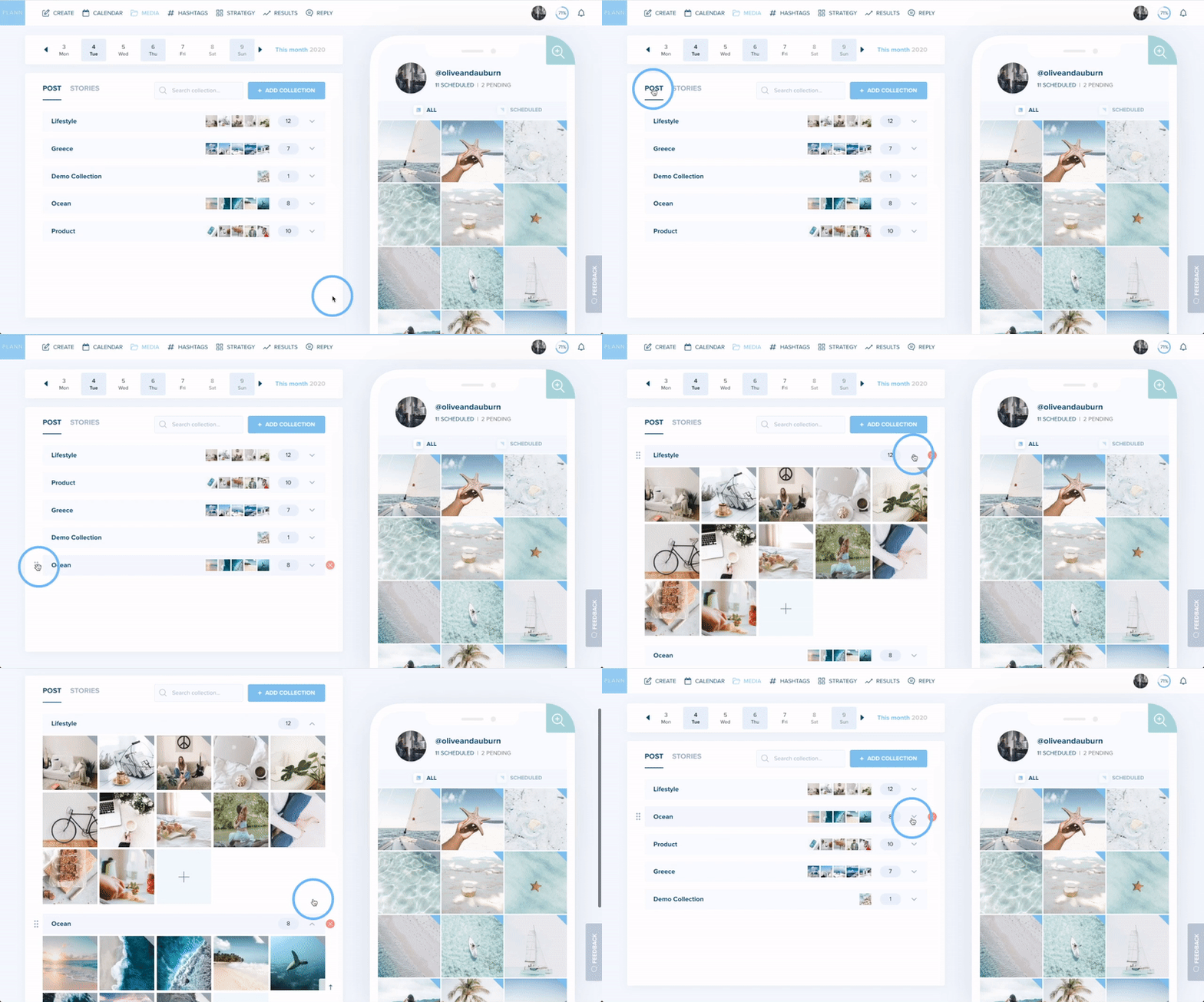
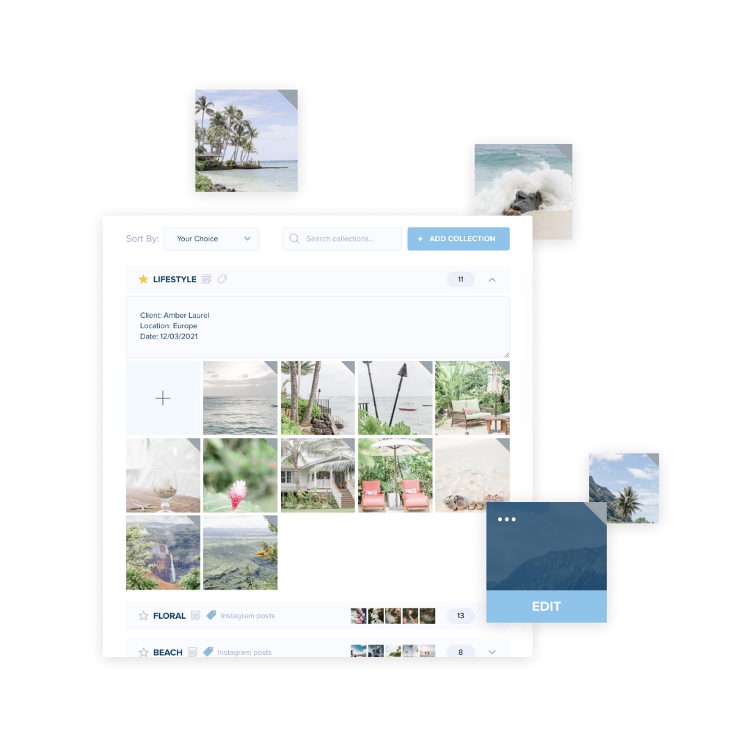
Next, you’ll need to fill in all the slots on your Instagram grid with images and photos. You can use the ‘media’ feature in Plann to import your favorite images and videos from your Google Drive, Google Photos, Dropbox or desktop.
Can’t find the perfect image or video? No worries! On Plann Desktop, have access to an extensive stock image library that will make designing your Instagram grid ten million times easier.
Edit Your Images To Create A Visually Appealing Instagram Grid
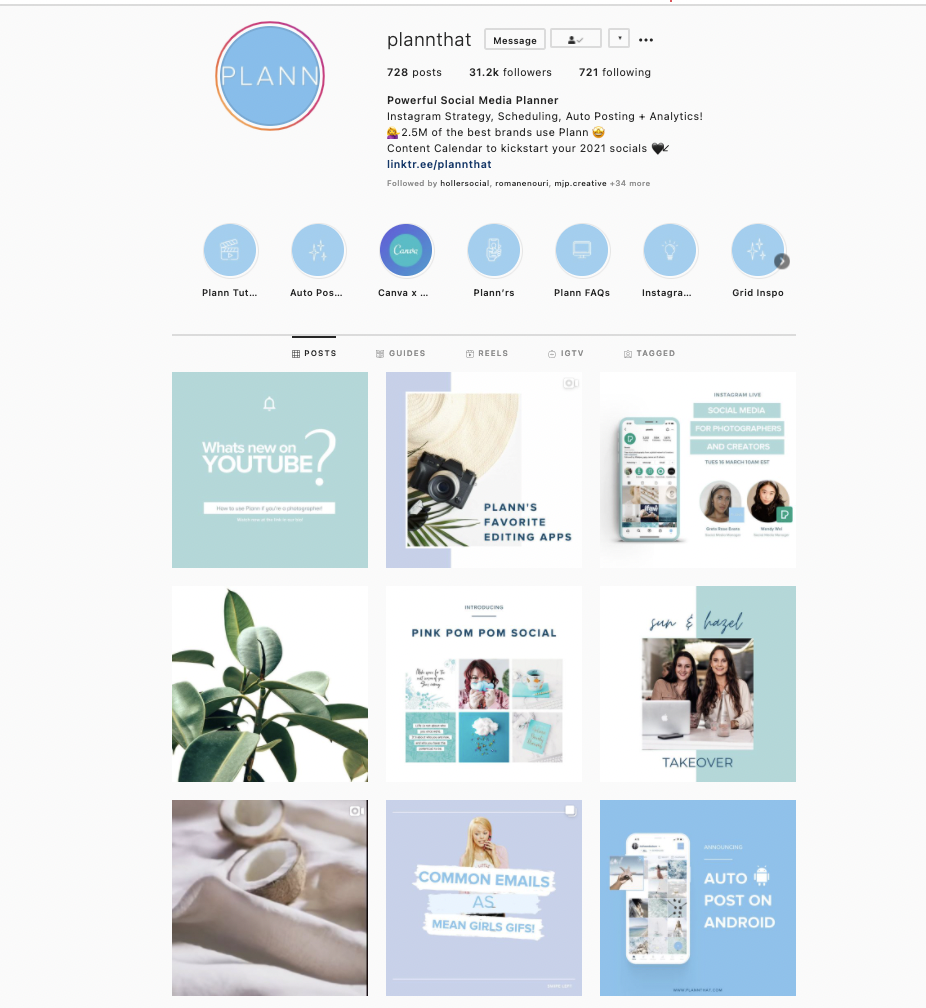
how to design grid on desktop
To design your Instagram grid on a desktop you’ll first need to know what kind of grid style or ‘theme’ you’d like to create.Do you want a colorful, bright, cheery Instagram grid or do you prefer a more muted tone or beachy aesthetic? Would you prefer a warm or cool color palette?
Once you’ve decided on this, you can use Plann’s editing tools and filters inside our ‘magic wand’ tool to ceate a cohesive Instagram grid that attracts your ideal followers.
If you’d like some Instagram grid style inspiration, here is a rundown of our 24 favorite ideas.
Not sure what colors are best for your brand? Head to the ‘results’ section inside Plann to see your best and worst performing color scheme, which can help give you some inspiration
Drag And Drop The Perfect Instagram Grid
Once you’ve chosen your themes, sourced your content and edited your Instagram photosyou are ready to drag and drop your grid to perfection.
With Plann, you can easily drag and content to quickly visualize what your account will look like once you’ve posted your content.
This will help you to make sure that your Instagram grid has ‘visual flow’ and encourages potential followers to hang around a little longer when they land on your profile.
If you have a visually stunning Instagram grid , it’s way more likely that someone new will want to scroll through your grid, like a few pictures and leave a few comments… to the point where they’ll probably end up following you too!
Scheduling Instagram Posts From A Desktop
With the Plann web version, you can not only upload, edit, and plan your Instagram feed posts. With our new auto posting feature, you can also automatically post them, too! This mean you can spend less time ‘gramming and more time doing the other things you love, like bingeing Netflix or hanging with friends.
Ready to design and schedule your Instagram grid on a desktop?
Log into Plann or start your free trial today

