In the world of social media, it’s important to make a lasting impression. Creating clear, consistent, and purposeful content can help you stand out online.
On visual-first social media platforms like Instagram, producing high-quality images and video content is the best way to expand your reach and increase engagement. A visually appealing Instagram Feed can help you entice new followers, build brand awareness and even inspire conversion.
Whether you’re a brand, small business or an influencer, a well-curated Instagram grid is the key to social media success, offering great opportunities for discoverability and engagement.
So, keep reading to discover everything you need to know about planning the perfect Instagram feed and how to master your Instagram grid layout.
Why your Instagram grid layout matters
When other users visit your Instagram account, your grid layout is the first thing they’ll see. This means that your most recent Instagram posts have an important role in representing your account (and business) to new people.
Maintaining a visually appealing Instagram grid can help you to capture interest of profile visitors, making them more likely to follow you and pay attention to your brand’s future content.
A well-structured approach to Instagram grid planning can also help you communicate your brand’s purpose and values quickly and easily, telling users what you offer and how your account can help them.
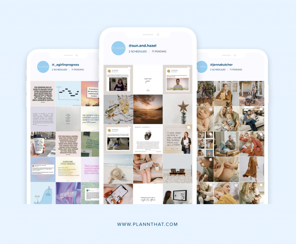
Visually appealing Instagram grids help to drive increased engagement by including high-quality images and videos with effective calls to action. Why does this matter? Well, higher engagement can help you reach larger audiences, get seen in the Instagram algorithm and convert followers into customers.
How to create a visually appealing Instagram feed
There are a stack of ways to start curating a visually appealing Instagram feed. We’ve narrowed it down to our favorite Instagram tips and tricks to help you use an Instagram feed planner to improve your Instagram posts and grid layout.
Tip 1. Showcase your branding
Instagram is the perfect place to show off your visual branding, helping to establish your business or account as recognizable and familiar.
You can easily incorporate branding details by creating content using your brand’s colour palette and fonts. For extra visual consistency, use these details for your Instagram Stories highlight covers too.
If you don’t have brand colours in place yet, you can visit the results tool in the Plann app to search for your account’s best-performing colors. Try to choose just three to five colors that represent your brand’s values and tone of voice.
Looking for stunning on-brand imagery to share to Instagram? With Plann (the ultimate Instagram feed planner), you’ll score access to thousands of royalty free images to choose from.
Tip 2. Edit your photos
Photo-editing is an Instagram staple, and it’s important to learn how to do it well. High-quality Instagram photos often achieve much better reach and engagement results than images that are pixelated, low-resolution or blurry.
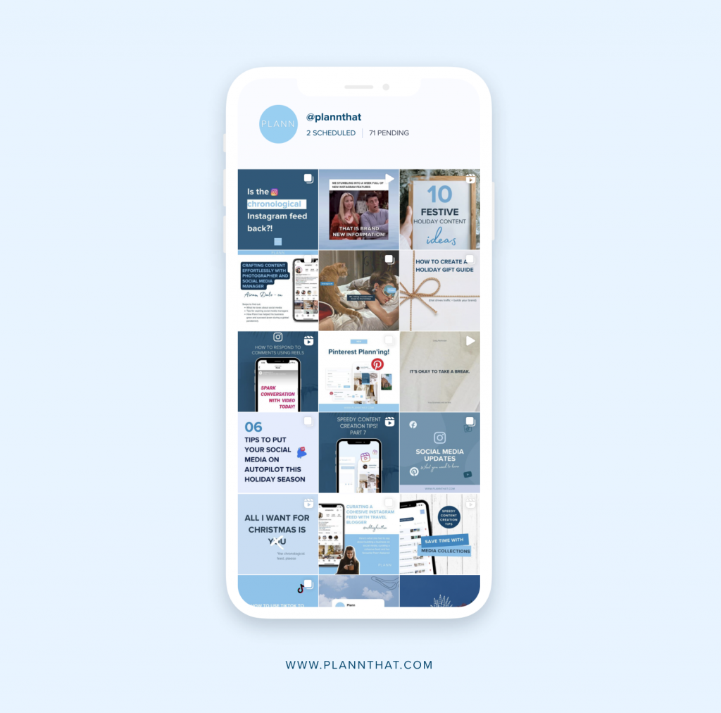
When curating your Instagram grid layout, consistency is essential. The best way to maintain a cohesive aesthetic is by applying the same editing styles and filters to all of your images.
To keep your editing style simple, choose a filter that works well for your brand and your desired visual aesthetic, and use this for all posts.
If you want to adjust image brightness and saturation or add text, overlays, and filters, you can access easy-to-use in-built editing tools with a free Plann account.
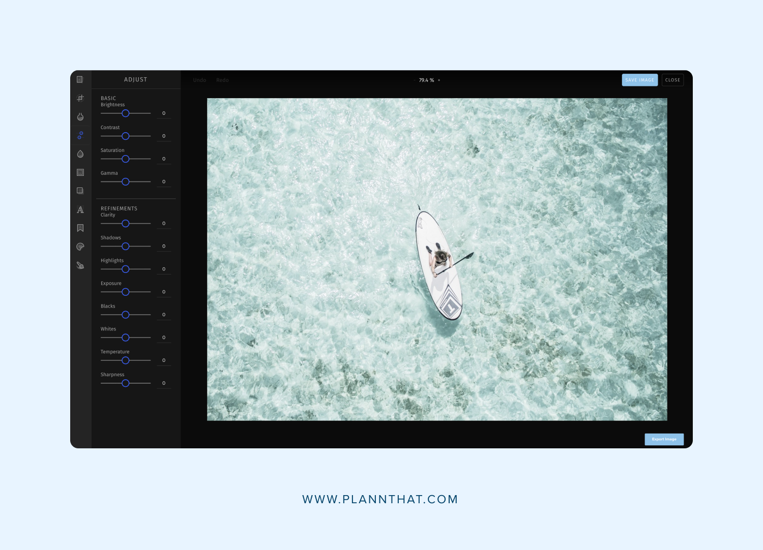
Tip 3. Be purposeful and consistent
One of the most important components when planning your Instagram feed is to have clear goals in mind. This will help you to create a grid that accurately reflects your brand and your core messages.
When producing visual content for Instagram, ensure your visual content clearly captures your brand’s values and purpose. Your posts should work together to create a cohesive grid, but they should also have power and meaning when they stand alone.
You can keep track of your Instagram posts and curate your grid layout by using an intuitive Instagram scheduling tool like Plann.
Creative Instagram feed layout ideas
There are many different kinds of visually appealing Instagram feeds and grid layouts that you can replicate on your own account. Here are some of our favorite ideas to get you started!
Instagram Grid Idea 1: The classic grid
The classic grid is a favorite for a reason! This theme is great for brands in search of a flexible content option that isn’t too restrictive or tricky to follow.
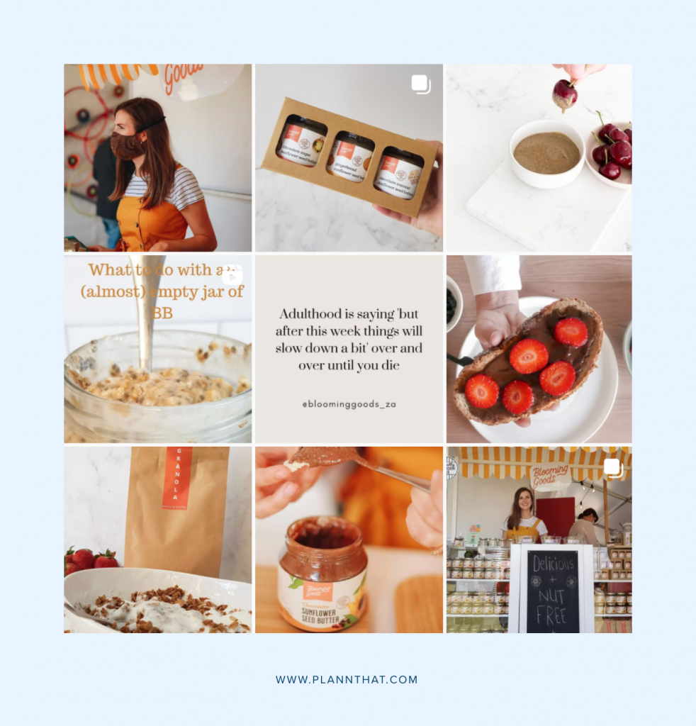
Using a classic feed layout, you can share images and videos that detail all aspects of your business, from planning launches to packing orders and everything in between.
With a focus on sharing a variety of content formats (rather than sticking to a rigid structure or formula), this Instagram grid layout is perfect for beginners.
Make sure that your images and assets remain consistent, showcase your brand identity and engage your audience by applying the same filters to all the content you post.
Instagram Grid Idea 2: The checkerboard grid
The checkerboard grid is another popular choice, offering a patterned structure to a businesses’ Instagram feed layout.
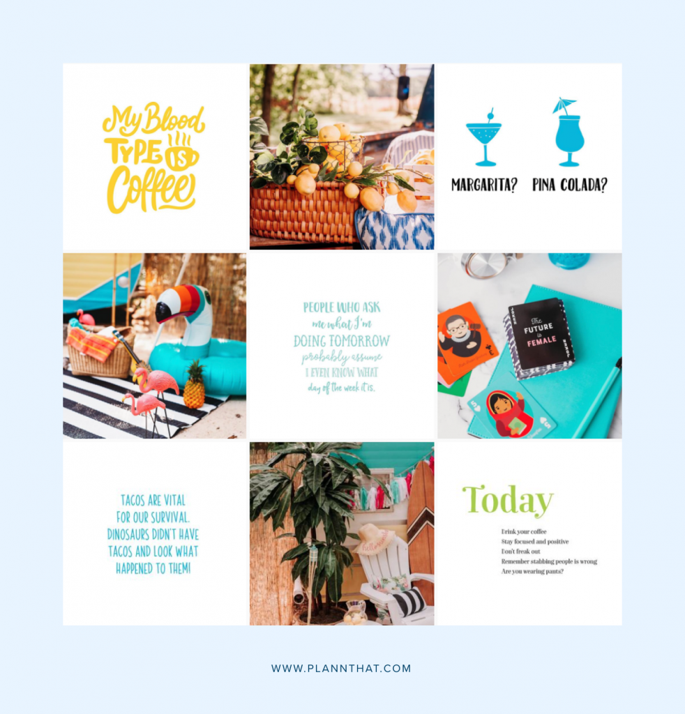
When applying the checkerboard grid, you’ll alternate posts between two main visual styles, creating a pattern that users will see when they visit your feed. Try alternating between a Reel and an image or a graphic template followed by a photo.
There are several variations of the checkerboard grid. If changing styles on every second post doesn’t work for you, try creating a visual pattern using rows or columns instead.
Instagram Grid Idea 3: The color-coordinated grid
The color-coordinated grid is perfect for Instagram branding connoisseurs! This layout focuses on using your brand colours as often as possible.
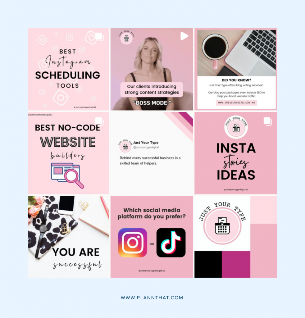
Color-coordinated Instagram posts should always feature two or more colours from your brand’s color palette, helping to achieve a cohesive look across your grid.
Harnessing your brand colors is a great way to make your brand memorable and to apply visual consistency with ease. Plus, there’s no way a profile visitor is going to forget your brand after landing on your Instagram grid!
Instagram Grid Idea 4: The illustrated grid
Creative Instagrammers often turn to artistic feed layout styles, such as the illustrated grid. This style allows for fun, quirky posts that users will want to see more of.
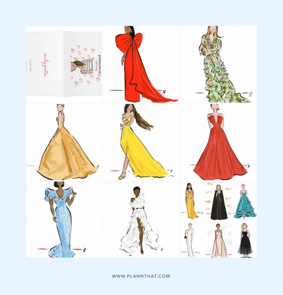
Using the illustrated grid, you’ll share images and videos that feature graphic design and illustrated elements that relate closely to your brand and its purpose.
You might choose to produce designed or illustrated content to represent your products or services or even to facilitate a marketing campaign! The key here is to make sure you’re sharing bespoke illustrated content or properly crediting your sources when sharing content to build your own Instagram grid layout.
Instagram Grid Idea 5: The puzzle grid
Though sometimes challenging to apply, the Instagram puzzle grid has great visual impact and is a popular style for many brands.
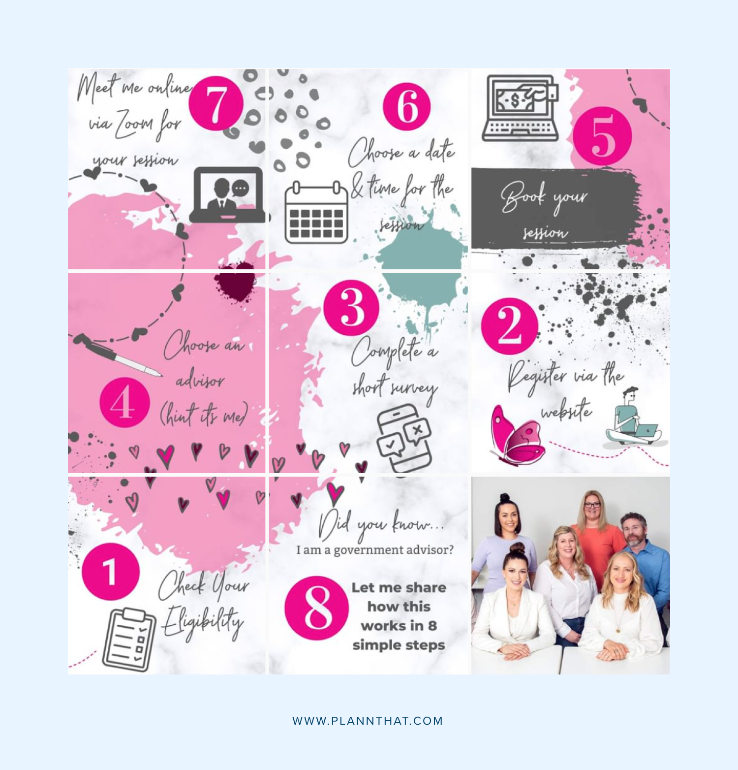
Rather than focusing on each post individually, the puzzle grid layout allows you to consider your feed as a whole, sharing several images that work together to achieve a shared visual effect.
The puzzle grid requires plenty of planning, so it’s important to ensure that you have a clear vision for what you’re trying to communicate and how your feed will look on the ‘gram.
Improve your Instagram feed with Plann
If you’re ready to improve your Instagram and engagement, it’s time to start Plann’ing ahead! This way, you can create clear and visually effective goals-driven content.
Sign up for a free 7-day trial of Plann today and you can manage your entire social media strategy from one effortless dashboard and supercharge your account with all the tools you need to craft a compelling Instagram feed.


