Late last year, the worlds most notable colour company released the ‘Pantone 2017 Colours’, so in case you missed them, here’s what Pantone have implied will be the colours making bold appearances this year.
2016 Pantone Colours of the Year
Before we get into Pantone 2017, let’s cast our mind back to 2016.
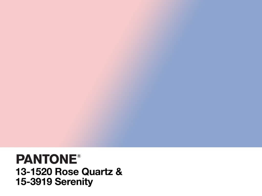
The colours of the year were Rose Quartz & Serenity.
These soft hues influenced everything from fashion, home decor to design. We’ve seen an influx of this palette on Instagram with many a fashion forward accounts embracing the colours to style their feed to perfection.
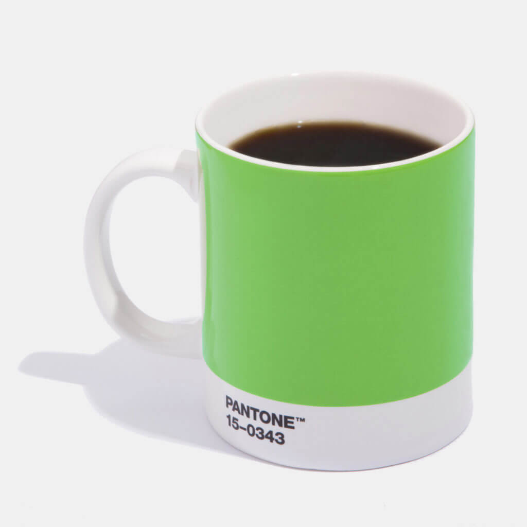
Pantone 2017 ‘COLOR OF THE YEAR!’ GREENERY!
PANTONE 15-0343 Greenery is a warm and zesty yellow-green shade that nourishes our need for reaffirmation and rebirth as it evokes the first days of spring when nature’s greens refresh, restore and renew. Illustrative of flourishing foliage and the lushness of the great outdoors, the fertile attributes of Greenery signals to us to take a deep breath, oxygenate and reinvigorate.
Secondary colours
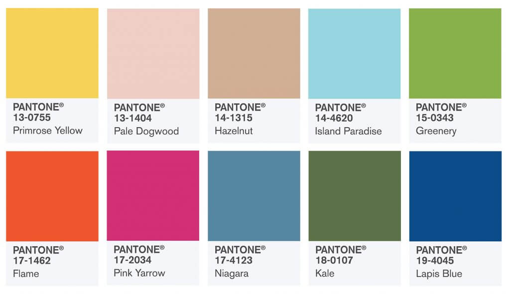
Interestingly, a more subdued sub-list has made an appearance this year with more earthy colours such as Kale and Hazelnut dominating the landscape. If you’re worried that’s not leaving you much color to play with? Get ready to put on your sunglasses!
Pink is still a strong colour for this year with Pale Dagwood and Pink Yarrow predicted to be the most used feminine hues.
Of course here at Plann, we’re pretty happy that there are many shades of blue and we’re thrilled to see Niagara, Lapis Blue and Island Paradise in the list (if you haven’t checked out our Instagram yet, you’ll notice these are our colours!)
How can you use the Pantone 2017 colours in your imagery?
Pantone colours influence fashion, decor and Instagram feeds every year, so we’d love to show you how Instagrammers are already using the Pantone 2017 colours in their work.
