Take a typical consumer who’s using Instagram in the way most of us do: they’re scrolling through their Explore feed — or maybe a hashtag feed — and a photo catches their eye.
The image is great, or hilarious, or for some other reason holds instant intrigue and, as a bonus, the caption compliments it perfectly. They tap the username and take a look at the profile.
No matter what reason is behind your brand being on Instagram, this is a pivotal moment. Any goal you could conceivably have hinges on these critical few seconds.
Because at this moment, a few rapid-fire decisions are made: are they going to read your bio? Click the link? Are they going to follow you? This all depends on how your profile is designed. Was it created intentionally as a whole cohesive structure, specifically engineered to keep the eyes, get the following, and turn them into a fan?
When they land on your profile, the grid of thumbnails encompasses the majority of the screen. Whether it is appealing to the eye — or even slightly grating and unattractive — will influence the decision. Thus, it is vitally important that you plan your Instagram feed.
How to Plan your Instagram Feed: Step 1 — Color Schemes
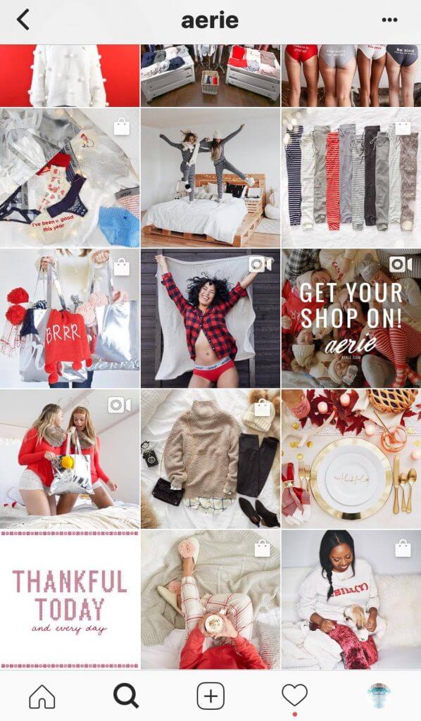
The color scheme is the broadest aspect of a planned Instagram feed. Aerie offers up a masterful example. They use an eggshell white as the base color, and gradually move from one highlight color (or two) to the next.
Looking at their whole Instagram grid layout, it’s easy to see that white (or negative space) takes up most of the photo area, and the color they’re featuring acts as a bold highlight for the section. As you scroll past you’ll notice that they’ll add one color, and take another away. This makes the blend of color appear as a gradual transition as you go through.
Each individual photo works visually on its own to be sure, but the image of the tiles taken together make for a compelling whole, as well.
How to Plan your Instagram Feed: Step 2 — Grids
After figuring out what colors you’re going to use, next you have to decide what your grid will look like. This is a key step in planning your Instagram feed because it finishes the process that was started by curating your color plan.
How you design your grid affects how the color is “worn” by your profile. Capitalize on it by designing something smart and cohesive. How you design your grid will intrinsically influence which of your photos stick out.
Take this example of a vertically-themed aesthetic approach by @elskabody from our blog about Instagram grid layouts:
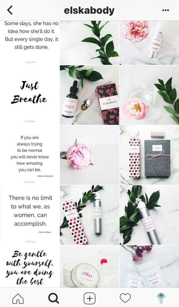
You see how the vertical line theme draws attention to both the quotes and the images. Additionally, they use a simple, overarching color scheme, with certain photos accented by a statement color.
In this case, it’s easy for your eye to move to the photos with the leaves. As it happens, the photos with leaves tend to work down the feed, encouraging a viewer to keep looking.
Use grids to your advantage in conjunction with color to capture the eye of your potential follower, and encourage them to stay on your profile. More people spending more time enjoying your content — that’s what it’s about.
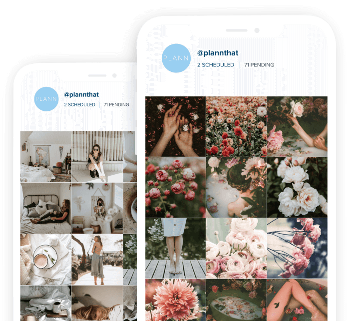
Plann makes it easy to plan your grids. Upload your pictures in a big bulk batch ahead of time. Then you can easily tap and drag them into whatever order you like. Make planning and organizing your Instagram feed easy.
Plan Your Instagram Feed Step 3: Punctuate with Borders and Whitespace
If you have a background in design, then you’re well-versed in whitespace. Surprisingly, this quintessential design tenet is often overlooked on Instagram. Because of that, and because it’s good design practice anyway, it’s a great opportunity to capitalize on an important aesthetic and earn views.
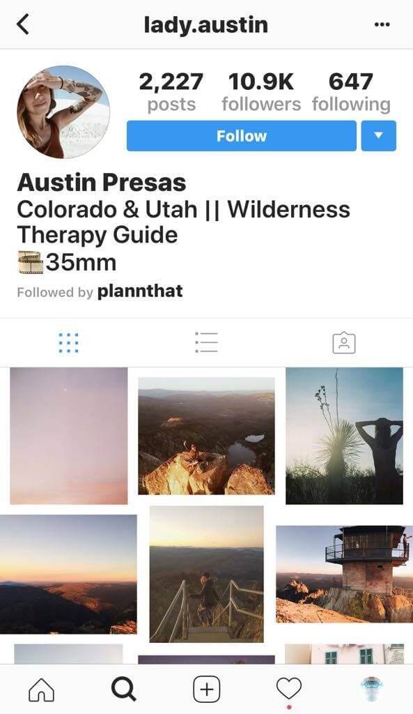
White borders are a resplendent stratagem for cleaning up your Instagram feed and adding some polish and a crisply minimalist vibe, while thoughtfully bringing certain favorite or key photos to light.
You don’t necessarily have to add borders or whitespace to every picture. Playing with it in a clever way can give your tiles an excellent look when taken as a whole. Let’s say for example you’re employing a checker pattern, using alternating dark and light colors. But every three or four rows, instead of all borders of all images touching and making one mega-image, the center image could have an extra-wide, bold white border. Make sense? Cool!
In that example, that center photo is going to stand out, and anyone who lands on your feed will likely notice that photo first. If they scroll and you have another, similarly highlighted photo a few rows down, they’ll notice that one, too.
Because those photos will be noticed that much more, they will enjoy notably higher engagement in the form of comments, likes, etc., making them ideal for important messages, stories, or marketing.
If you’re a lifestyle blogger looking to leverage your audience, that’s where you put the sponsored post. If you’re selling products, that’s where you position a crowd favorite and tag a product.
Don’t feel too bad if it wasn’t obvious to you why curating your feed with these sorts of strategies in mind was important. It’s just all about getting that casual user to click the “follow” button, and the path for getting them there is, interestingly, based on an interplay of shapes and colors and how they work together to deliver your content.
