Have you ever had so much time on your hands that you color coordinate your wardrobe or your bookshelf or your sock drawer?
If yes: HOW GOOD DID IT FEEL WHILE IT LASTED? If not: That’s ok. Unless you’re Marie Kondo the general public doesn’t really get to see your wardrobe, or bookshelf or sock drawer, right? But when it comes to your Instagram feed; Color plays a vital role in how effective your page is at gaining and keeping followers.
And now that you’re using Plann (woo-hoo) there’s no reason why you too, with a little effort, can’t spark joy right here on your own grid!
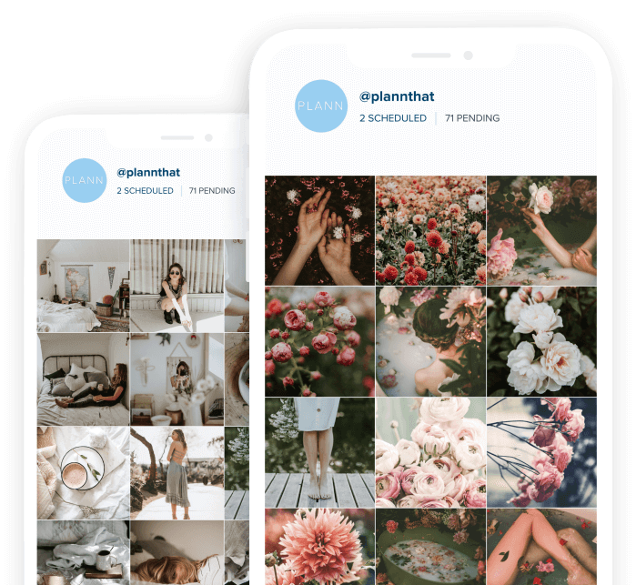
Having a consistent color scheme on your grid not only gives peace of mind to the viewer but helps create a notable signature style for you and your brand to create within and helps you have a way more inviting aesthetic for those who take a quick glance and decide to whether or not to follow.
So how do you color coordinate your grid like a pro? We’ve got a few solid pointers that will steer you in the right direction.
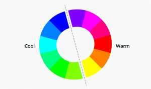
First of all, we love this handy color theory chart created by our friends over at Canva. It’s a great resource that will educate you on all things color. This will help you to decide if you want to go for a warm or cool color palette and even give you more of an insight into colors, tints and tones, hue, saturation and luminance which will come in handy for editing your images with filters and planning them out to get your images looking great side by side, and create a consistent color scheme everyday.
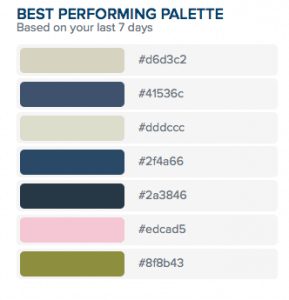
On your Plann app you will also find a color palette generator that shows you a snapshot of your own palette for the last 12 images you posted, which makes it nice and easy to follow a consistent color theme on your own account. You can even take a sneak peek at other accounts you like to see the color palette they’re using. Simply tap the sneak peek button and enter the name of the account you love. You will be able to see what palette they’re using and integrate that into your strategy right away.
Plann out a week’s (or more) worth of content in advance so that you can see what your grid will look like with your chosen color palette. This is a sure-fire way to make sure your grid, as a whole, looks amazing, again and again.
Planning your content looks like getting your filters consistent across your images, placing the images in order to fit your brand’s unique strategy on Plann, and seeing if you like what you see.
And if not, the beauty of Plann is that you can move things around until you love it.
Here are some Planner’s who we think will inspire you to master your color palette:
We love Pro Planner and Instagram boss babe Jenna Kutcher. Check out her theme below which sparks joy every time we look at it. Jenna is a prime example of executing a color palette with precision and sticking to a plann every time.
https://www.instagram.com/jennakutcher
We also love this planner; Emma Laue Children, who has effortlessly nailed the art of color palette transition which you can see as her grid moves from different hues of blue, orange and aqua seamlessly. (That’s how it’s done).
https://www.instagram.com/emmalauechildren
Hopefully, you never look at Instagram the same way again and remember, if it doesn’t spark joy my friends, unfollow.
Happy Planning!
