If you’ve been on Instagram for more than a few years, you’ve likely seen the split, collage-style Instagram designs on people’s feeds.
You likely saw a snippet of the image on your newsfeed and thought ‘huh, what’s that meant to be?’… only to visit their profile and see the bigger picture realised ‘ohhhh, it’s part of a collage.’
This can be a way to create intrigue and pique curiosity about your product — which is why you’ll often see them be used by new businesses or in the lead-up to launches.
It’s for this reason that this strategy was extremely popular a few years ago…and seems to be on the brink of a comeback.
However, the cons outweigh the pros, which is why we don’t recommend splicing or splitting an image — particularly if you’re in the early growth stage of your business.
With your customers and the future of your sales in mind, here are 4 reasons to avoid the cutty cutty slash slash!
4 reasons not to split or splice your images on Instagram

1. It only looks good every third post
So you’ve sliced and diced an image and posted a beautiful 9 grid using one image. Now what?
The next time you post that beautiful picture might not look as fabulous as you’d thought, now that cut up image of your model showing off your product might have her head resting on a random elbow.
It will take adding another few pictures to the mix to have the photo line up again making this type of post only effective every 3rd post.

that poor kitty
2. Your existing customers will be confused
We think it’s important to think about your existing followers — those that might already be buying from you, sharing your work or watching your brand closely before they finally commit to purchase.
After all, you’ve worked your little buns off to get them to notice you and follow your Instagram feed.
Now they’re getting a mass of images in their newsfeed in a row that don’t make any sense (unless they go to your full feed to view your masterpiece).
No matter how much people love a brand, it’s very rare they’re going to stay interested if they feel like they’re being spammed.
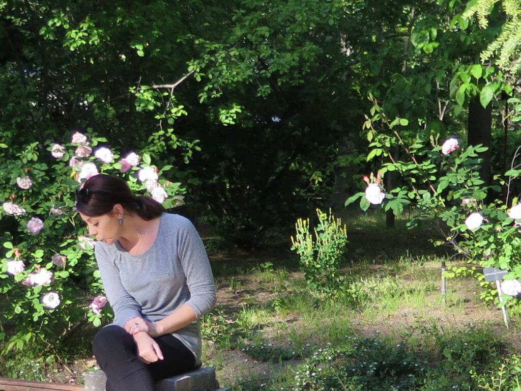
on it’s own this pic looks like I’m spitting on the ground, no?
3. It’s bad for engagement
Instagram have made no secret that they’re prioritising engagement, with the emphasis being put on sharing content that provides value and starts a jolly-good conversation.
Think about how many people are going to comment once you have split an image?
You might get the odd “What is that? Is that an ear?!”, but they’re probably not going to comment on all of the images, which unfortunately means only 1 or 2 of your 9 images is going to get any love (if any). If you’ve been hoping to make the group of ‘top 9’ hashtags, or have someone else share your post, this is probably not going to be effective.

un-remarkable.
4. It gives no context
When you see only one part of a post, it gives you zero context for the rest of that post. And, considering a lot of people just spend a lot of time scrolling aimlessly on newsfeed rather than checking out specific profiles, it’s likely going to leave a lot of people feeling confused! This means that new people who have come across your post are unlikely to follow you… and those already following you might feel compelled to hit the unfollow button

cutty cutty slash slash
What to do instead
The good news is, there’s now a way more effective way to tell a story on Instagram build hype around a new product or launch. You see, this collage-style Instagram grid design was popular before Instagram stories existed! Now, you can use carousel-style graphics to split your content into a few different frames to post on stories. This is a great way to get your audience more engaged with your content, as if they’re curious they will be able to swipe through to see more.
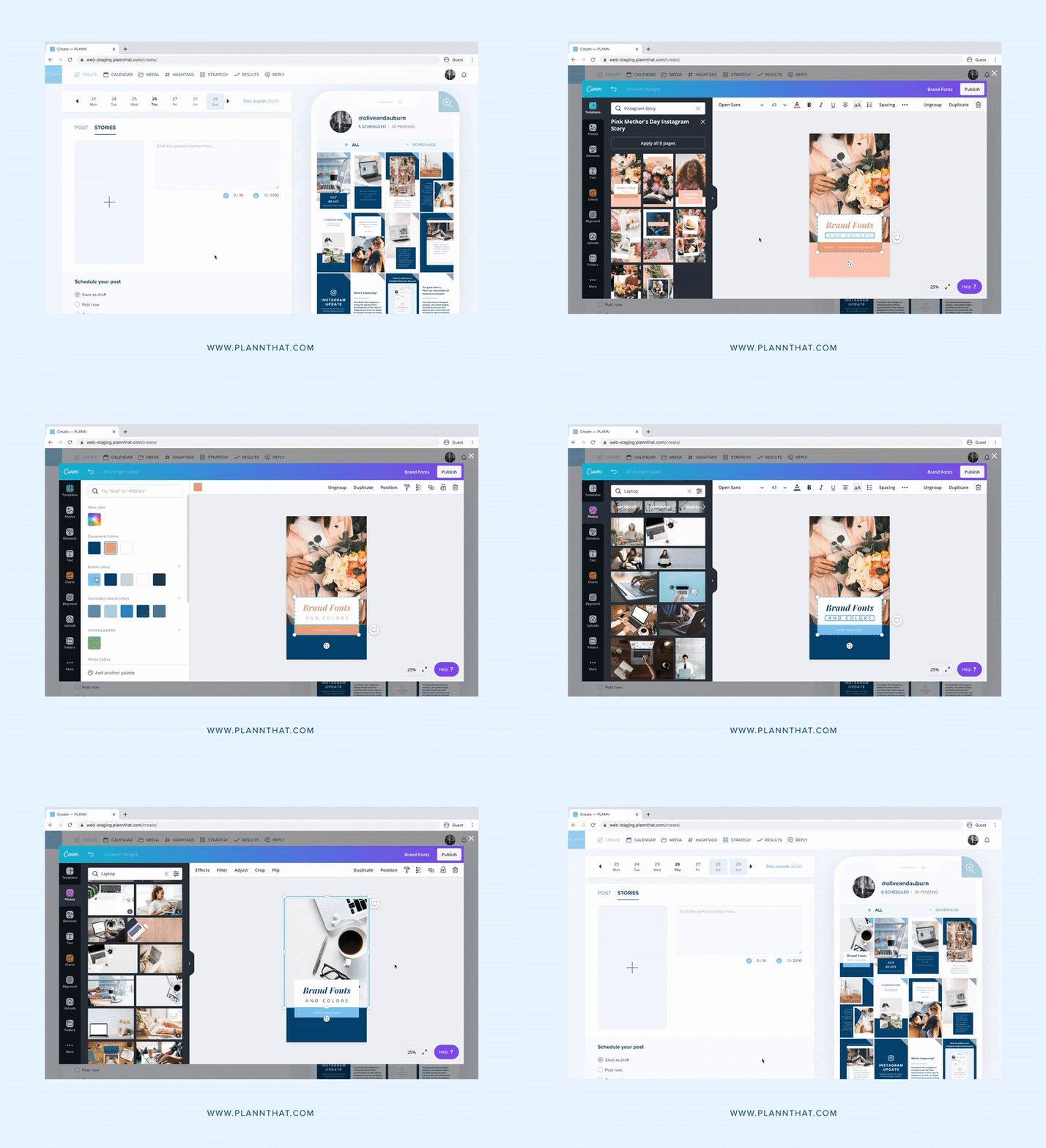
Thanks to our integration with Canva, you can access hundreds of free stories templates without even leaving the app. Just customize with your own brand colors and content, schedule it your stories and watch your engagement soar.
Log into Plann or start your free trial today to experience the magic for yourself

