Instagram is a balancing act…it’s also really confusing.
Should it be your strategy to be authentic and transparent with your audience, showing them the ‘real you?’
Maybe your followers prefer a well designed and perfect grid, one that shows your life at it’s best – something to aspire to. What about colour themes, hashtags and filters?
Man, being on the ‘gram is tricky.

That’s why Plann came up with the strategy tool – a way for you to design themes based on what you’re trying to achieve.
After all, you don’t want a series of similar images boring your audience to tears.
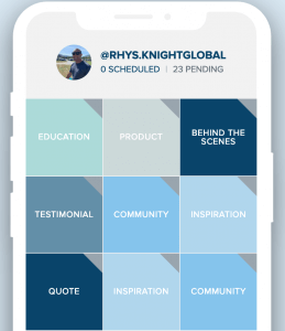
Here’s how it works, log in and click on the strategy button. From there, you can choose what your grid will look like and how it will be designed over time.
Maybe like this…
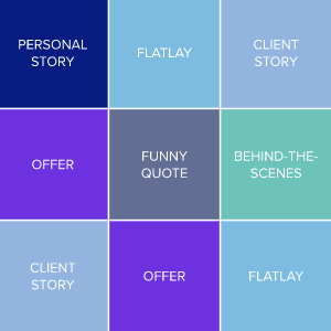
…or this…
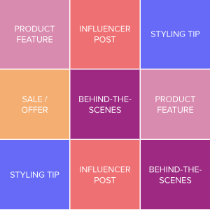
…what about this?
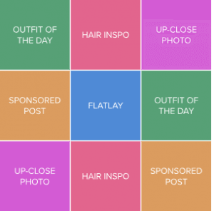
The result is a grid that is exciting, engaging and communicates your brand in a single glance.
Like, if you’re a hairdresser, it’s not just a bunch of cool styles, it’s pics in the salon, testimonials from satisfied clients and the occasional pic of you doing something that’s unique to you.
Once you’ve decided on the what images will appear and when you can apply the strategy to your grid – only you can see it, but it gives you a visual guide to work off, then drag and drop into your grid –
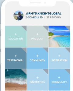
Easy! Combined with hashtags and scheduling, you’ve got a structured process for creating content that’s consistently awesome!
That’s why Plann came up with the strategy tool – a way for you to design themes based on what you’re trying to achi

